- Ovation Test Presentation

Содержание
- 2. Lots of Bullets (26 to be exact) This is the 1st bullet This is the 2nd
- 3. There is no Title on this slide. It tests margins and different levels of bullets. Just
- 4. 7 Long Bullets (Text Resizing) This slide is certainly not very easy to love. There is
- 6. This slide has a Title and one Large Image
- 7. Santa Cola Merry Xmas Everybody! And to all a Good Night! Ho-ho-ho-ho! Drink Coke! Leave the
- 8. Ok, how about a slide to test the ppt layout This slide is intentionally formatted horribly
- 9. “Shaded” Org Chart to test Auto Shapes
- 11. Скачать презентацию
Lots of Bullets (26 to be exact)
This is the 1st bullet
This
Lots of Bullets (26 to be exact)
This is the 1st bullet
This
There is no Title on this slide. It tests margins and
There is no Title on this slide. It tests margins and
7 Long Bullets (Text Resizing)
This slide is certainly not very easy
7 Long Bullets (Text Resizing)
This slide is certainly not very easy
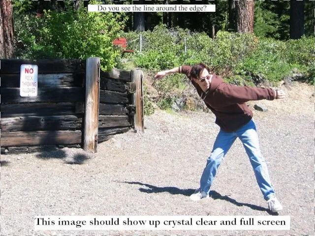
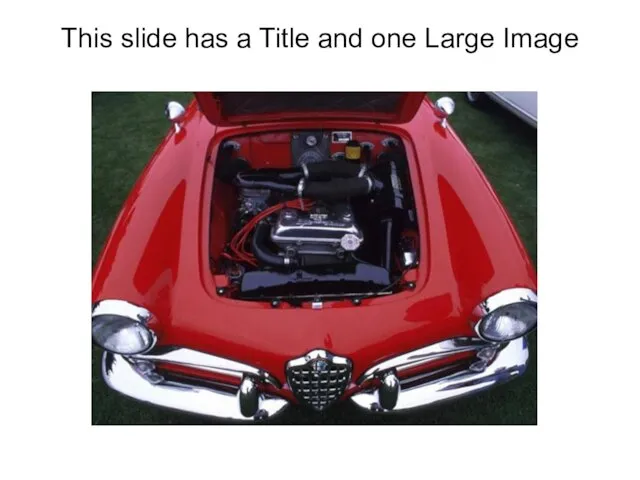
This slide has a Title and one Large Image
This slide has a Title and one Large Image
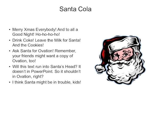
Santa Cola
Merry Xmas Everybody! And to all a Good Night! Ho-ho-ho-ho!
Drink
Santa Cola
Merry Xmas Everybody! And to all a Good Night! Ho-ho-ho-ho!
Drink
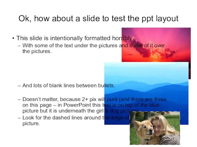
Ok, how about a slide to test the ppt layout
This slide
Ok, how about a slide to test the ppt layout
This slide
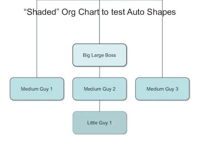
“Shaded” Org Chart to test Auto Shapes
“Shaded” Org Chart to test Auto Shapes
 The USA.
 Все звуки английского языка и описание их произношения
 Презентация по английскому языку Переход прилагательных в существительные.
  Christopher Marlowe
 Люди и предметы вокруг нас (lesson 45)
 Мой день
 Презентация к уроку английского языка "How to write an essay" - скачать
 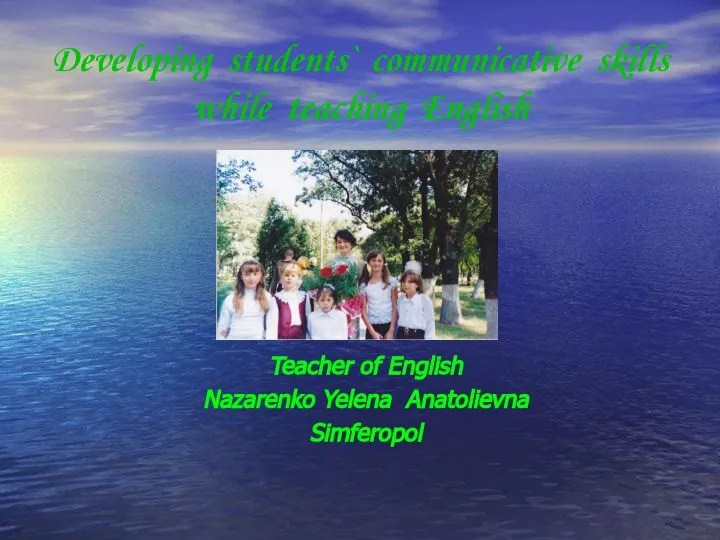 Developing students` communicative skills while teaching English Teacher of English Nazarenko Yelena Anatolievna Simferopol
  Monuments to Cultural figures of Stavropol region
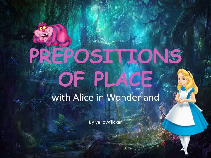 Prepositions of place
 Present Perfect Continuous
 My travelling
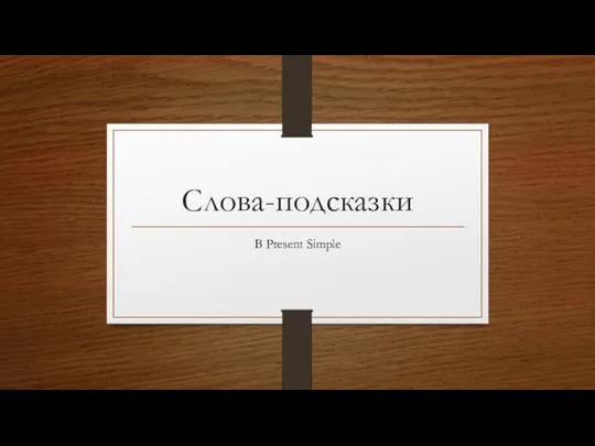 Слова-подсказки В Present Simple
 Children’s fashion autumn-winter 2011-2012
 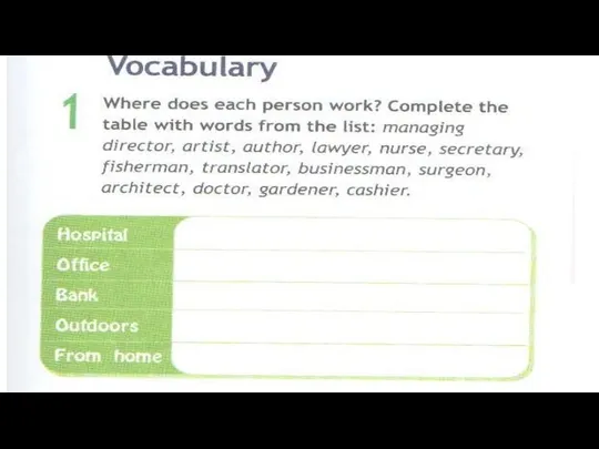 Vocabulary
 Кровотечение. Классификация. Временные и окончательные методы остановки кровотечения
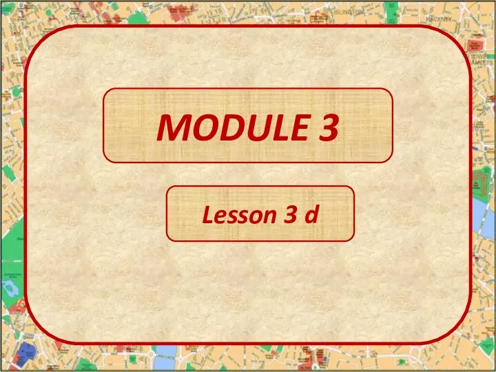 Module 3. lesson 3d
 My dream trip
 Littering is crime
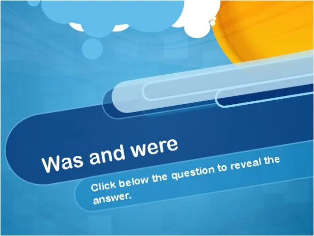 Was and were
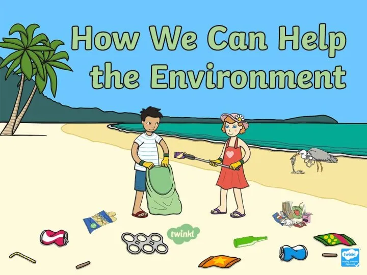 How We Can Help the Environment
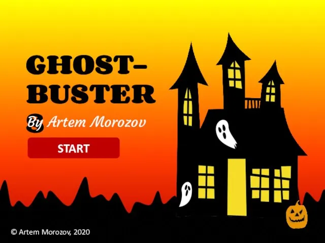 Ghost-busters
 TV and Cinema
 Презентация к уроку английского языка "День благодарения" - скачать
 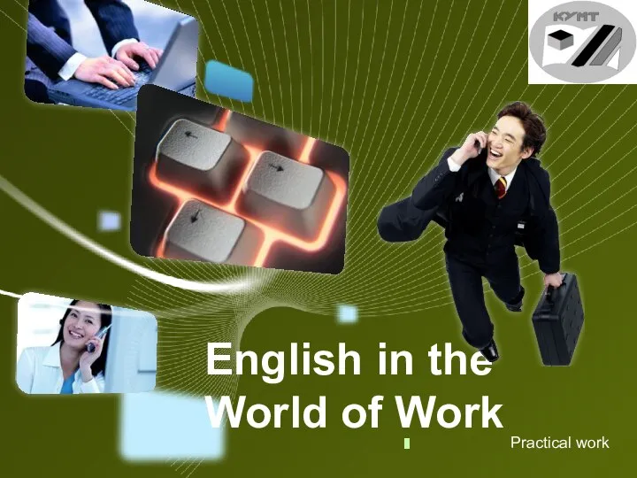 English in the World of Work PW
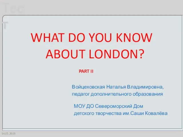 What do you know about London?
 Spring holidays
 Thomas Gainsborough (1727-1788) an English portrait and landscape painter. Богданова Анастасия Сергеевна Учитель английского языка ГБОУ №544 Санкт-Петербург