- Computational Programming. Part 5

Содержание
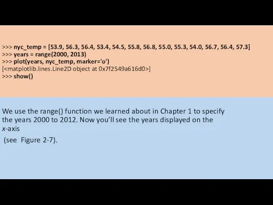
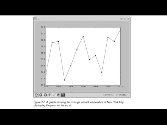
- 3. >>> nyc_temp = [53.9, 56.3, 56.4, 53.4, 54.5, 55.8, 56.8, 55.0, 55.3, 54.0, 56.7, 56.4, 57.3]
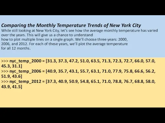
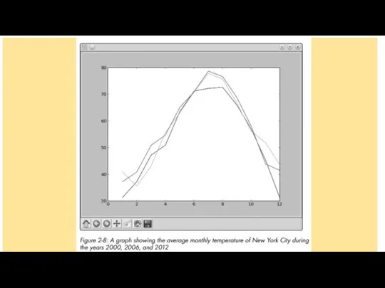
- 5. Comparing the Monthly Temperature Trends of New York City While still looking at New York City,
- 6. The first list corresponds to the year 2000, and the next two lists correspond to the
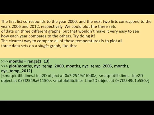
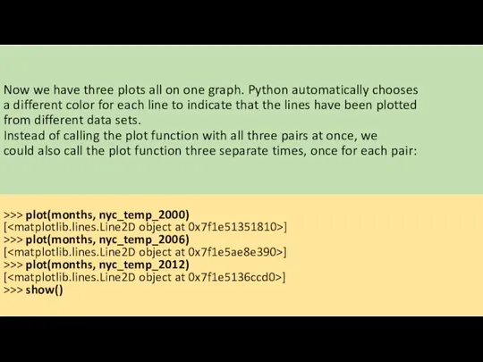
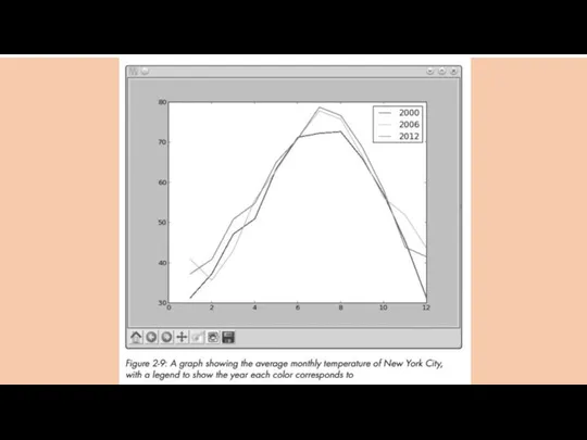
- 8. Now we have three plots all on one graph. Python automatically chooses a different color for
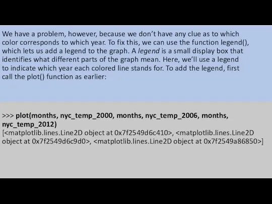
- 9. We have a problem, however, because we don’t have any clue as to which color corresponds
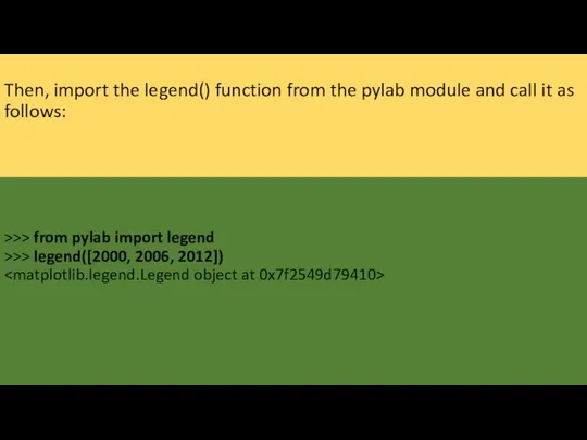
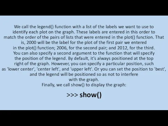
- 10. Then, import the legend() function from the pylab module and call it as follows: >>> from
- 11. We call the legend() function with a list of the labels we want to use to
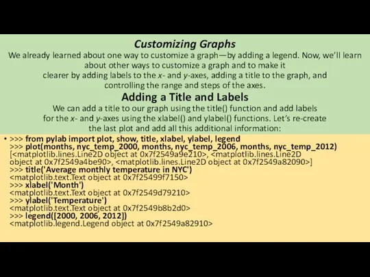
- 13. Customizing Graphs We already learned about one way to customize a graph—by adding a legend. Now,
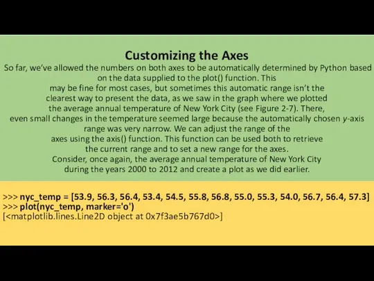
- 15. Customizing the Axes So far, we’ve allowed the numbers on both axes to be automatically determined
- 16. Now, import the axis() function and call it: >>> from pylab import axis >>> axis() (0.0,
- 17. The function returned a tuple with four numbers corresponding to the range for the x-axis (0.0,
- 19. Saving the Plots If you need to save your graphs, you can do so using the
- 21. Скачать презентацию

>>> nyc_temp = [53.9, 56.3, 56.4, 53.4, 54.5, 55.8, 56.8, 55.0,
>>> nyc_temp = [53.9, 56.3, 56.4, 53.4, 54.5, 55.8, 56.8, 55.0,
Comparing the Monthly Temperature Trends of New York City
While still looking
Comparing the Monthly Temperature Trends of New York City While still looking
The first list corresponds to the year 2000, and the next
The first list corresponds to the year 2000, and the next
Now we have three plots all on one graph. Python automatically
Now we have three plots all on one graph. Python automatically
We have a problem, however, because we don’t have any clue
We have a problem, however, because we don’t have any clue
Then, import the legend() function from the pylab module and call
Then, import the legend() function from the pylab module and call
We call the legend() function with a list of the labels
We call the legend() function with a list of the labels
Customizing Graphs
We already learned about one way to customize a graph—by
Customizing Graphs We already learned about one way to customize a graph—by

Customizing the Axes
So far, we’ve allowed the numbers on both axes
Customizing the Axes So far, we’ve allowed the numbers on both axes

Now, import the axis() function and call it:
>>> from pylab
Now, import the axis() function and call it:
>>> from pylab
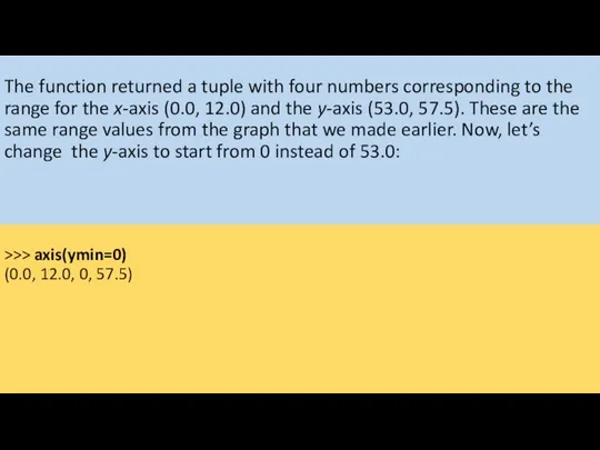
The function returned a tuple with four numbers corresponding to the
range
The function returned a tuple with four numbers corresponding to the range

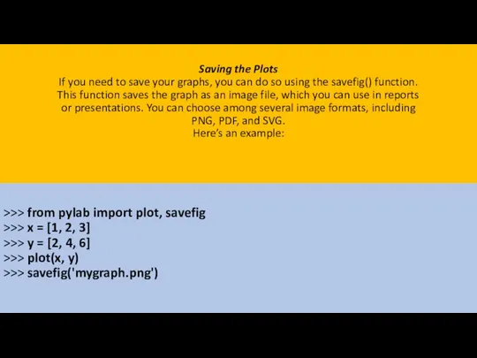
Saving the Plots
If you need to save your graphs, you can
Saving the Plots If you need to save your graphs, you can
 Интелектуалды жүйелер
 Основы алгоритмики. Библиотеки функций. Раздел 1. Общие правила
 Руководство по бронированию посещения Посольства через 24-часовую консульскую службу (для подачи на визы гражданами РФ)
 Теория компиляторов. Часть II. Лекция 3. Общие методы распараллеливания кода
 Производственная практика. ADO.NET и COM при работе с MS ACCESS и MS EXCEL в десктопном приложении
 Snowflake game
 Компьютерная графика. Основные понятия
 Поняття нових медіа
 Табличные базы данных
 Современные технологии продвижения ресторана в Интернет
 ЭОР - Электронные образовательные ресурсы
 Операции над высказываниями
 Администрирование БД. Репликация баз данных.
 Алгоритм работы с научной электронной библиотекой elibrary.ru и информационно-аналитической системой РИНЦ
 Современные лингвистические корпусы
 Dynamic management objects. Аргументы поиска (SARG). Денормализация БД. Лекция 6
 Работа с графикой
 Компьютерная графика
 Типы алгоритмов
 Внешние устройства ПК
 Защита информации
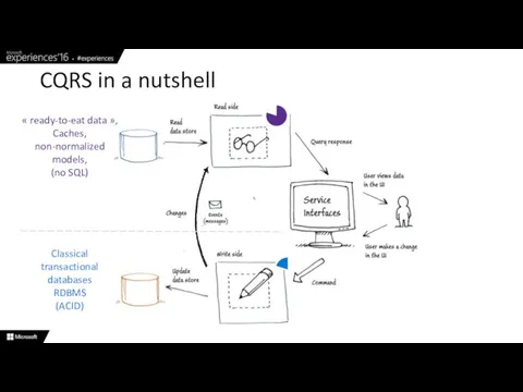 CQRS in a nutshell
 Уровни системы формирования информационной безопасности
 Представление информации в различных системах счисления
 Презентация "Социальные сети" - скачать презентации по Информатике
 Разбор задач 3-го этапа республиканской олимпиады по информатике 2018 года
 Проектирование баз данных. Анализ стоимости операций
 Конкурс: Интерактивная мозаика Организатор: Pedsovet.su Автор: Бирбраер Аркадий Викторович Место работы, должность: МАОУ «Лицей №