- Introduction to SmartUI SDK

Содержание
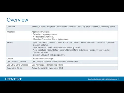
- 2. Overview
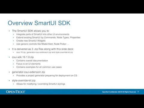
- 3. Overview SmartUI SDK The SmartUI SDK allows you to Integrate parts of SmartUI into other UI
- 4. Getting started with SmartUI SDK Download and unpack the SDK archive (csui-sdk-16.zip) Follow the Readme.md (You
- 5. Widget Development IDE Create a new UI development project based on CSUI project generator Download CSUI
- 6. Deployment through OScript Create an OScript module Orphan CSUI::Extension and specify the Require.js module prefix Populate
- 7. Extend Extend existing Smart UI components
- 8. SmartUI Extension Points Overview New Command Toolbar Inline Action bar Context menu Custom Column New metadata
- 9. New Command
- 10. New Command, Sample See greetings/src/commands/hello for a sample The hello command sample: Creates a command applicable
- 11. New Add Item command See greetings/src/commands/add.hello for a sample See greetings/src/commands/add.hello/add.hello.command.md for documentation The add.hello command:
- 12. Custom Column
- 13. Custom Column See greetings/src/controls/cells/hello for a sample The greetings/src/controls/cells/hello column: Shows the text "Text", "Hypertext" or
- 14. Custom Column: What controls the table columns REST API v1/node/:id/nodes provides Node properties Property schema Custom
- 15. Custom Column: Rich Picture
- 16. Custom Column: Table cells supporting classes
- 17. Custom Column: How the table columns are displayed
- 18. Custom Column: Built-in table columns RequireJS modules “csui/widgets/nodestable/cells/*” Date (registered for type -7) DateTime (registered for
- 19. Custom Column: Creating a custom table column Create a RequireJS module with a view descended from
- 20. Metadata
- 21. New Metadata Panel See greetings/src/widgets/metadata/panels/hello for a sample See csui-sdk-16.1.0/doc/widgets/metadata/doc/metadata.panels/index.html for documentation The Metadata Widget shows
- 22. New Metadata Property Panel See greetings/src/widgets/metadata/property.panels/hello for a sample See csui-sdk-16.1.0/doc/widgets/metadata/doc/metadata.property.panels/index.html for documentation The Property Panel
- 23. New Nodetype
- 24. New Nodetype: Overview For a new nodetype, one typically has to provide: An Icon specifying the
- 25. New Nodetype: Icon Extend nodesprites nodesprites is the central SmartUI icon factory Register custom icon Define
- 26. New Nodetype: Default Action See src/commands/open.brava/readme.me Define Command for Default Action (sample src/commands/open.brava in SDK) Define
- 27. New Nodetype: Register Action Publish command in bundles/greet-all.js Register command in csui-extenstions.json
- 28. New Nodetype: Perspectives Override Perspectives (configurations) are usually provided serverside through REST API (GET api/v1/perspectives), based
- 29. New Nodetype: Perspectives Override Depending on the perspective given by the server, there are two client-side
- 30. Custom URL
- 31. Custom URL: Overview Extend the URL schema of SmartUI to provide additional root urls or to
- 32. Custom URL path with perspective: How Perspective Changes Work Perspective Context Gathers models and collections, which
- 33. Custom URL: Change Perspective = Navigate var nextNode = context.getModel(NextNodeModelFactory); nextNode.set('id', 2000); var searchQuery = context.getModel(SearchQueryModelFactory);
- 34. Custom URL: Perspective Context Extensibility
- 35. Custom URL: Perspective Context Plugin Register perspective context plugin Declare context model to control the perspective
- 36. Custom URL: Perspective Router Extensibility Window location (URL) reflects the state of the context models. Changes
- 37. Custom URL: Perspective Router // Add to greet-extensions.json "csui/pages/start/perspective.routing": { "extensions": { "greet": [ "greet/perspective.routers/greetings/hello.perspective.router" ]
- 38. Custom URL: Recommendations If your scenario is connected to a route without any identifier or other
- 39. Custom URL: Sample Sample of “greetings” and “greetings/{greetSubject}” routes with context plugins: //greetings/src/perspective.context.plugins/greetings/ //greetings/src/perspective.routers/greetings/
- 40. Create A Widget Create new Smart UI components
- 41. Application Widget: Create Setup Create folder src/widgets/ Create main view (controller) .view.js Create widget manifest .manifest.json
- 42. Application Widget: Main view src/widgets/hello/hello.view.js
- 43. Application Widget: Manifest src/widgets/favorites/favorites.manifest.json
- 44. Application Widget: Registration src/greet-extensions.json
- 45. Application Widget: Widget in the Perspective Use the Require.js module folder path in the perspective
- 46. Integrate Integrate parts of Smart UI to other portals
- 47. Application Widgets: Overview Application Widgets allow to integrate parts of SmartUI into other environments, e.g. portals
- 48. Application Widgets: Supported Widgets Tiles Widgets Favorites (doc/widgets/favorites/doc/favorites/index.html) Recently Accessed (doc/widgets/recentlyaccessed/doc/recentlyaccessed/index.html) My Assignments (doc/widgets/myassignments/doc/myassignments/index.html) Shortcut Nodes
- 49. Integration Code Sample (NodesTable) csui.onReady2([’csui/widgets/nodestable/nodestable.view’], function (NodesTableView) { var context = new BrowsingContext(), nodesTableView = new
- 50. Controls Use Generic Controls
- 51. Generic Controls: Overview Dialogs Node Picker Modal Alerts File Open Perspectives Flow, Grid, Left-Center-Right, Single, Tabbed,
- 52. Generic Controls: Node Picker
- 53. Generic Controls: Node Picker Find samples at csui-sdk-16.1.0/lib/src/csui/dialogs/node.picker/test/index.html csui-sdk-16.1.0/lib/src/csui/dialogs/node.picker/test/index.try.html Find documentation at csui-sdk-16.1.0/doc/dialogs/node.picker/node.picker/index.html In index.html, search
- 54. Generic Controls: Modal Alert
- 55. Generic Controls: Modal Alert Find samples at csui-sdk-16.1.0/lib/src/csui/dialogs/modal.alert/test/index.show.html csui-sdk-16.1.0/lib/src/csui/dialogs/modal.alert/test/index.try.html Find documentation at csui-sdk-16.1.0/doc/dialogs/modal.alert/modal.alert/index.html
- 56. Generic Controls: File Open Find documentation at csui-sdk-16.1.0/doc/dialogs/file.open/file.open.dialog/index.html
- 57. Generic Controls: Perspectives, Samples Flow csui-sdk-16.1.0/lib/src/csui/perspectives/flow/test/index.html Grid csui-sdk-16.1.0/lib/src/csui/perspectives/grid/test/index.html Left-Center-Right csui-sdk-16.1.0/lib/src/csui/perspectives/left-center-right/test/index.html Single csui-sdk-16.1.0/lib/src/csui/perspectives/single/test/index.html Tabbed csui-sdk-16.1.0/lib/src/csui/perspectives/tabbed/test/index.html Tabbed-flow csui-sdk-16.1.0/lib/src/csui/perspectives/tabbed-flow/test/index.html
- 58. Replacing Bootstrap with Binf A namespaced version of Bootstrap as being used by SmartUI
- 59. Bootstrap to BINF: Overview
- 60. From Bootstrap to BINF In SmartUI, you have the complete Bootstrap styles and plugins available for
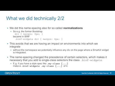
- 61. What we did technically 1/2 With BINF, every former Bootstrap style got now prefixed with ‘binf-’
- 62. What we did technically 2/2 We did this name-spacing also for so called normalizations So e.g.
- 63. Style Overrides Customize SmartUI by overriding CSS styles
- 64. Table of Contents Motivation Customization Example What Is Style Override Anatomy Of Style Overrides Smart UI
- 65. Motivation Maintaining a complete Smart UI styling is next to impossible. Parametrized theming became to be
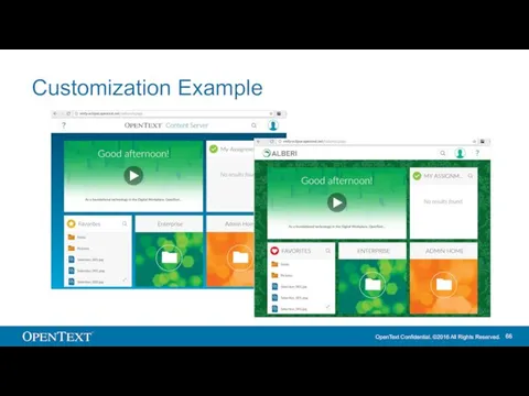
- 66. Customization Example
- 67. What Is Style Override A selector contains an original style defined by Smart UI default theme:
- 68. Anatomy Of Style Overrides Style overrides are a directory with stylesheets, fonts and images, which are
- 69. Smart UI Settings Available only with CS 16.0.3 (December)
- 70. Custom Page Using CS UI Widgets Find the element, which loads the original Smart UI stylesheet.
- 72. Скачать презентацию
Overview
Overview
Overview SmartUI SDK
The SmartUI SDK allows you to
Integrate parts of
Overview SmartUI SDK
The SmartUI SDK allows you to
Integrate parts of
Getting started with SmartUI SDK
Download and unpack the SDK archive (csui-sdk-16.zip)
Follow
Getting started with SmartUI SDK
Download and unpack the SDK archive (csui-sdk-16.zip)
Follow
Widget Development IDE
Create a new UI development project based on CSUI
Widget Development IDE
Create a new UI development project based on CSUI
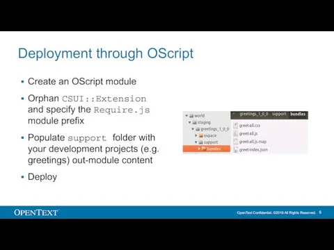
Deployment through OScript
Create an OScript module
Orphan CSUI::Extension and specify the Require.js
Deployment through OScript
Create an OScript module
Orphan CSUI::Extension and specify the Require.js

Extend
Extend existing Smart UI components
Extend
Extend existing Smart UI components
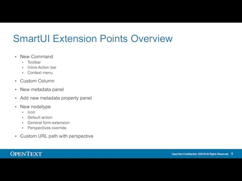
SmartUI Extension Points Overview
New Command
Toolbar
Inline Action bar
Context menu
Custom Column
New metadata
SmartUI Extension Points Overview
New Command
Toolbar
Inline Action bar
Context menu
Custom Column
New metadata
New Command
New Command
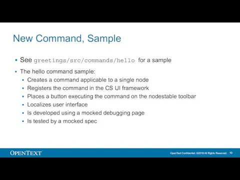
New Command, Sample
See greetings/src/commands/hello for a sample
The hello command sample:
Creates a
New Command, Sample
See greetings/src/commands/hello for a sample
The hello command sample:
Creates a
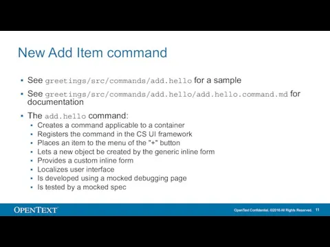
New Add Item command
See greetings/src/commands/add.hello for a sample
See greetings/src/commands/add.hello/add.hello.command.md for documentation
The
New Add Item command
See greetings/src/commands/add.hello for a sample
See greetings/src/commands/add.hello/add.hello.command.md for documentation
The
Custom Column
Custom Column
Custom Column
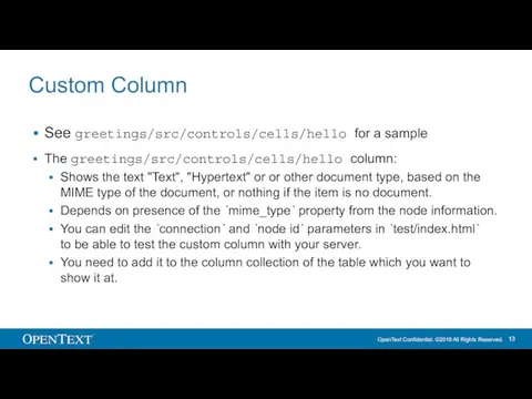
See greetings/src/controls/cells/hello for a sample
The greetings/src/controls/cells/hello column:
Shows the text "Text",
Custom Column
See greetings/src/controls/cells/hello for a sample
The greetings/src/controls/cells/hello column:
Shows the text "Text",
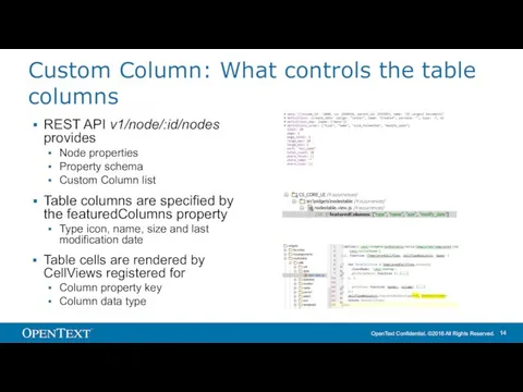
Custom Column: What controls the table columns
REST API v1/node/:id/nodes provides
Node properties
Property
Custom Column: What controls the table columns
REST API v1/node/:id/nodes provides
Node properties
Property
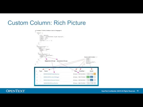
Custom Column: Rich Picture
Custom Column: Rich Picture
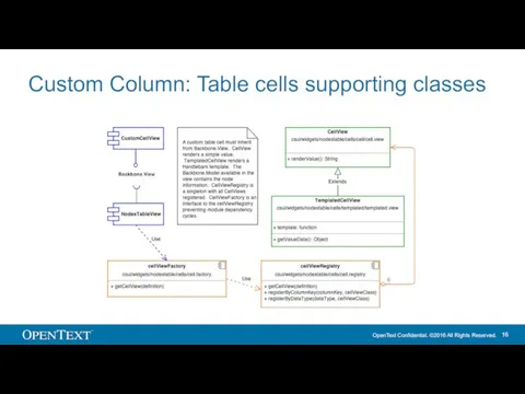
Custom Column: Table cells supporting classes
Custom Column: Table cells supporting classes
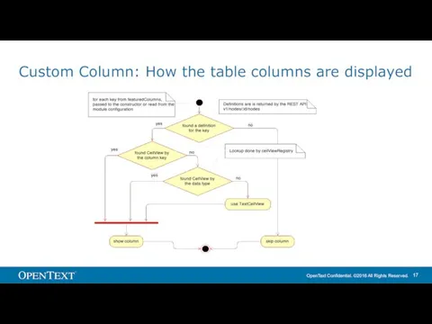
Custom Column: How the table columns are displayed
Custom Column: How the table columns are displayed
Custom Column: Built-in table columns
RequireJS modules “csui/widgets/nodestable/cells/*”
Date (registered for type -7)
DateTime
Custom Column: Built-in table columns
RequireJS modules “csui/widgets/nodestable/cells/*”
Date (registered for type -7)
DateTime
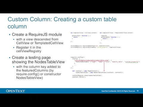
Custom Column: Creating a custom table column
Create a RequireJS module
with a
Custom Column: Creating a custom table column
Create a RequireJS module
with a

Metadata
Metadata
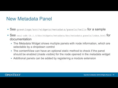
New Metadata Panel
See greetings/src/widgets/metadata/panels/hello for a sample
See csui-sdk-16.1.0/doc/widgets/metadata/doc/metadata.panels/index.html for documentation
The Metadata
New Metadata Panel
See greetings/src/widgets/metadata/panels/hello for a sample
See csui-sdk-16.1.0/doc/widgets/metadata/doc/metadata.panels/index.html for documentation
The Metadata
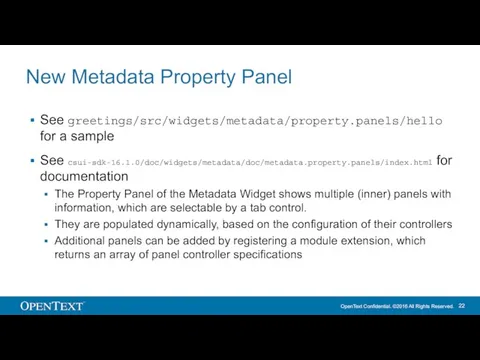
New Metadata Property Panel
See greetings/src/widgets/metadata/property.panels/hello for a sample
See csui-sdk-16.1.0/doc/widgets/metadata/doc/metadata.property.panels/index.html for documentation
The
New Metadata Property Panel
See greetings/src/widgets/metadata/property.panels/hello for a sample
See csui-sdk-16.1.0/doc/widgets/metadata/doc/metadata.property.panels/index.html for documentation
The

New Nodetype
New Nodetype
New Nodetype: Overview
For a new nodetype, one typically has to provide:
An
New Nodetype: Overview
For a new nodetype, one typically has to provide:
An
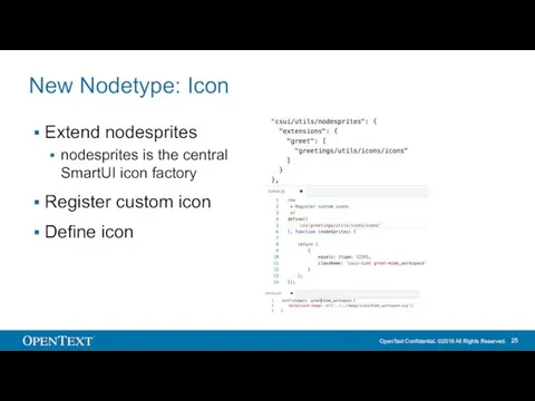
New Nodetype: Icon
Extend nodesprites
nodesprites is the central SmartUI icon factory
Register
New Nodetype: Icon
Extend nodesprites
nodesprites is the central SmartUI icon factory
Register
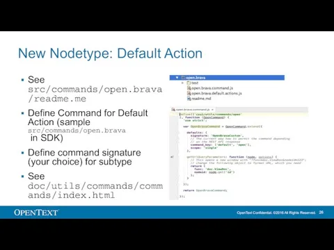
New Nodetype: Default Action
See src/commands/open.brava/readme.me
Define Command for Default Action (sample src/commands/open.brava
New Nodetype: Default Action
See src/commands/open.brava/readme.me
Define Command for Default Action (sample src/commands/open.brava
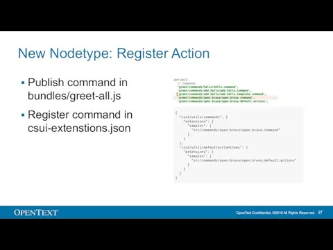
New Nodetype: Register Action
Publish command in bundles/greet-all.js
Register command in csui-extenstions.json
New Nodetype: Register Action
Publish command in bundles/greet-all.js
Register command in csui-extenstions.json
New Nodetype: Perspectives Override
Perspectives (configurations) are usually provided serverside through REST
New Nodetype: Perspectives Override
Perspectives (configurations) are usually provided serverside through REST
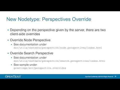
New Nodetype: Perspectives Override
Depending on the perspective given by the server,
New Nodetype: Perspectives Override
Depending on the perspective given by the server,

Custom URL
Custom URL
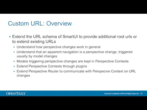
Custom URL: Overview
Extend the URL schema of SmartUI to provide additional
Custom URL: Overview
Extend the URL schema of SmartUI to provide additional
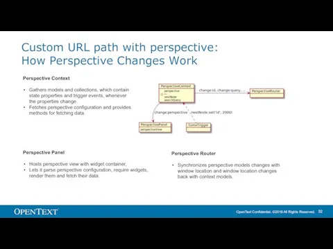
Custom URL path with perspective:
How Perspective Changes Work
Perspective Context
Gathers models and
Custom URL path with perspective:
How Perspective Changes Work
Perspective Context
Gathers models and
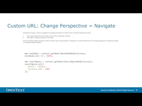
Custom URL: Change Perspective = Navigate
var nextNode = context.getModel(NextNodeModelFactory);
nextNode.set('id', 2000);
var searchQuery
Custom URL: Change Perspective = Navigate
var nextNode = context.getModel(NextNodeModelFactory);
nextNode.set('id', 2000);
var searchQuery
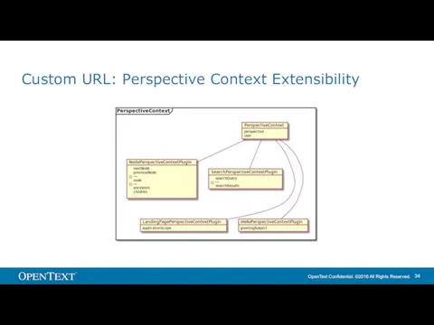
Custom URL: Perspective Context Extensibility
Custom URL: Perspective Context Extensibility
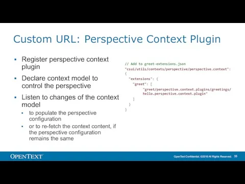
Custom URL: Perspective Context Plugin
Register perspective context plugin
Declare context model to
Custom URL: Perspective Context Plugin
Register perspective context plugin
Declare context model to
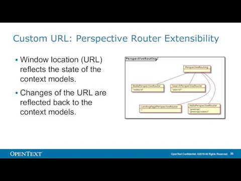
Custom URL: Perspective Router Extensibility
Window location (URL) reflects the state of
Custom URL: Perspective Router Extensibility
Window location (URL) reflects the state of
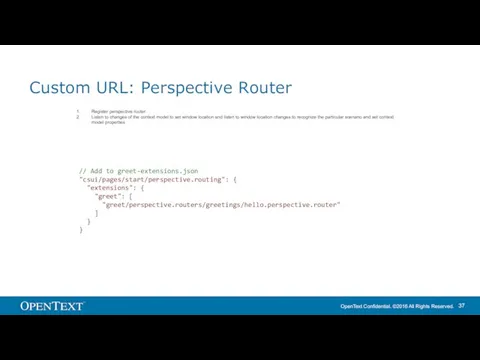
Custom URL: Perspective Router
// Add to greet-extensions.json
"csui/pages/start/perspective.routing": {
"extensions": {
"greet":
Custom URL: Perspective Router
// Add to greet-extensions.json
"csui/pages/start/perspective.routing": {
"extensions": {
"greet":
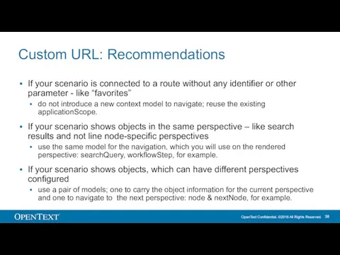
Custom URL: Recommendations
If your scenario is connected to a route without
Custom URL: Recommendations
If your scenario is connected to a route without
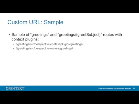
Custom URL: Sample
Sample of “greetings” and “greetings/{greetSubject}” routes with context plugins:
//greetings/src/perspective.context.plugins/greetings/
//greetings/src/perspective.routers/greetings/
Custom URL: Sample
Sample of “greetings” and “greetings/{greetSubject}” routes with context plugins:
//greetings/src/perspective.context.plugins/greetings/
//greetings/src/perspective.routers/greetings/
Create A Widget
Create new Smart UI components
Create A Widget
Create new Smart UI components
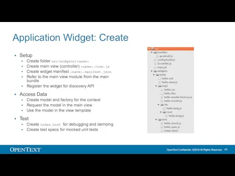
Application Widget: Create
Setup
Create folder src/widgets/
Create main view (controller) .view.js
Create widget manifest
Application Widget: Create
Setup
Create folder src/widgets/
Create main view (controller)
Create widget manifest
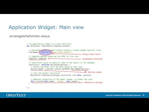
Application Widget: Main view
src/widgets/hello/hello.view.js
Application Widget: Main view
src/widgets/hello/hello.view.js
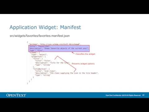
Application Widget: Manifest
src/widgets/favorites/favorites.manifest.json
Application Widget: Manifest
src/widgets/favorites/favorites.manifest.json
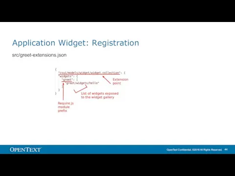
Application Widget: Registration
src/greet-extensions.json
Application Widget: Registration
src/greet-extensions.json
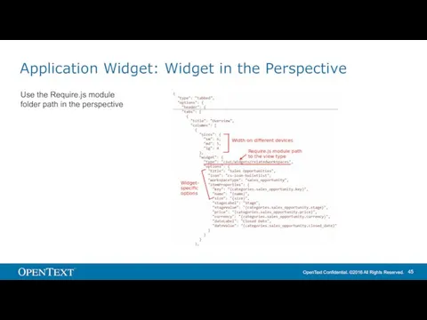
Application Widget: Widget in the Perspective
Use the Require.js module folder path
Application Widget: Widget in the Perspective
Use the Require.js module folder path

Integrate
Integrate parts of Smart UI to other portals
Integrate
Integrate parts of Smart UI to other portals
Application Widgets: Overview
Application Widgets allow to integrate parts of SmartUI into
Application Widgets: Overview
Application Widgets allow to integrate parts of SmartUI into
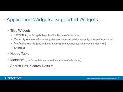
Application Widgets: Supported Widgets
Tiles Widgets
Favorites (doc/widgets/favorites/doc/favorites/index.html)
Recently Accessed (doc/widgets/recentlyaccessed/doc/recentlyaccessed/index.html)
My Assignments (doc/widgets/myassignments/doc/myassignments/index.html)
Shortcut
Nodes Table
Metadata
Application Widgets: Supported Widgets
Tiles Widgets
Favorites (doc/widgets/favorites/doc/favorites/index.html)
Recently Accessed (doc/widgets/recentlyaccessed/doc/recentlyaccessed/index.html)
My Assignments (doc/widgets/myassignments/doc/myassignments/index.html)
Shortcut
Nodes Table
Metadata
![Integration Code Sample (NodesTable) csui.onReady2([’csui/widgets/nodestable/nodestable.view’], function (NodesTableView) { var context =](/_ipx/f_webp&q_80&fit_contain&s_1440x1080/imagesDir/jpg/508617/slide-48.jpg)
Integration Code Sample (NodesTable)
{
var context = new BrowsingContext(),
nodesTableView = new NodesTableView({
context: context
data: {
start: {id: 2000}
}
}),
nodesTableRegion = new Marionette.Region({el: '#browser'});
GlobalMessage.setMessageRegionView(nodesTableView);
nodesTableRegion.show(nodesTableView);
context.fetch();
});
From Bootstrap to BINF
Integration Code Sample (NodesTable)
var context = new BrowsingContext(),
nodesTableView = new NodesTableView({
context: context
data: {
start: {id: 2000}
}
}),
nodesTableRegion = new Marionette.Region({el: '#browser'});
GlobalMessage.setMessageRegionView(nodesTableView);
nodesTableRegion.show(nodesTableView);
context.fetch();
});
From Bootstrap to BINF

Controls
Use Generic Controls
Controls
Use Generic Controls
Generic Controls: Overview
Dialogs
Node Picker
Modal Alerts
File Open
Perspectives
Flow, Grid, Left-Center-Right, Single, Tabbed, Tabbed-flow
Generic Controls: Overview
Dialogs
Node Picker
Modal Alerts
File Open
Perspectives
Flow, Grid, Left-Center-Right, Single, Tabbed, Tabbed-flow
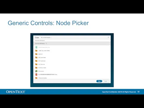
Generic Controls: Node Picker
Generic Controls: Node Picker
Generic Controls: Node Picker
Find samples at
csui-sdk-16.1.0/lib/src/csui/dialogs/node.picker/test/index.html
csui-sdk-16.1.0/lib/src/csui/dialogs/node.picker/test/index.try.html
Find documentation at
csui-sdk-16.1.0/doc/dialogs/node.picker/node.picker/index.html
In index.html,
Generic Controls: Node Picker
Find samples at
csui-sdk-16.1.0/lib/src/csui/dialogs/node.picker/test/index.html
csui-sdk-16.1.0/lib/src/csui/dialogs/node.picker/test/index.try.html
Find documentation at
csui-sdk-16.1.0/doc/dialogs/node.picker/node.picker/index.html
In index.html,
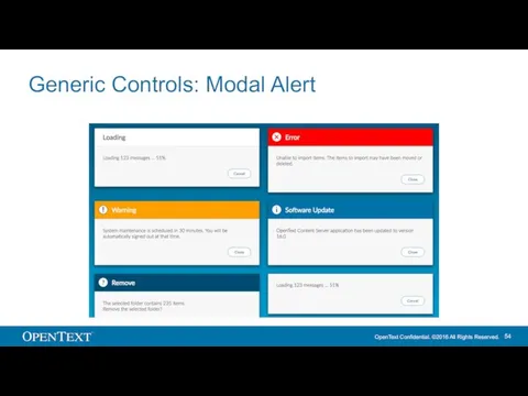
Generic Controls: Modal Alert
Generic Controls: Modal Alert
Generic Controls: Modal Alert
Find samples at
csui-sdk-16.1.0/lib/src/csui/dialogs/modal.alert/test/index.show.html
csui-sdk-16.1.0/lib/src/csui/dialogs/modal.alert/test/index.try.html
Find documentation at
csui-sdk-16.1.0/doc/dialogs/modal.alert/modal.alert/index.html
Generic Controls: Modal Alert
Find samples at
csui-sdk-16.1.0/lib/src/csui/dialogs/modal.alert/test/index.show.html
csui-sdk-16.1.0/lib/src/csui/dialogs/modal.alert/test/index.try.html
Find documentation at
csui-sdk-16.1.0/doc/dialogs/modal.alert/modal.alert/index.html
Generic Controls: File Open
Find documentation at
csui-sdk-16.1.0/doc/dialogs/file.open/file.open.dialog/index.html
Generic Controls: File Open
Find documentation at
csui-sdk-16.1.0/doc/dialogs/file.open/file.open.dialog/index.html
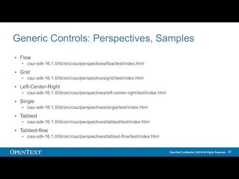
Generic Controls: Perspectives, Samples
Flow
csui-sdk-16.1.0/lib/src/csui/perspectives/flow/test/index.html
Grid
csui-sdk-16.1.0/lib/src/csui/perspectives/grid/test/index.html
Left-Center-Right
csui-sdk-16.1.0/lib/src/csui/perspectives/left-center-right/test/index.html
Single
csui-sdk-16.1.0/lib/src/csui/perspectives/single/test/index.html
Tabbed
csui-sdk-16.1.0/lib/src/csui/perspectives/tabbed/test/index.html
Tabbed-flow
csui-sdk-16.1.0/lib/src/csui/perspectives/tabbed-flow/test/index.html

Replacing Bootstrap with Binf
A namespaced version of Bootstrap as being used
Replacing Bootstrap with Binf
A namespaced version of Bootstrap as being used
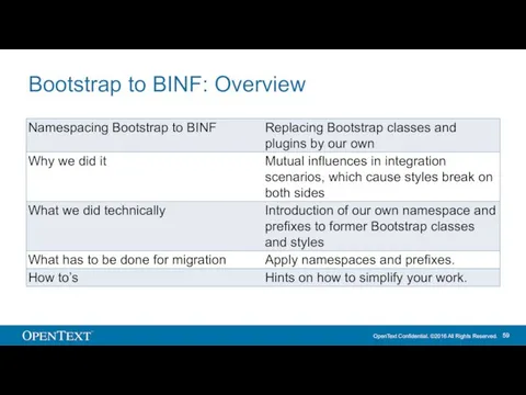
Bootstrap to BINF: Overview
Bootstrap to BINF: Overview
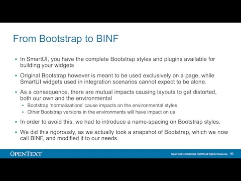
From Bootstrap to BINF
In SmartUI, you have the complete Bootstrap styles
From Bootstrap to BINF
In SmartUI, you have the complete Bootstrap styles
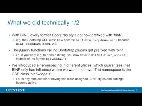
What we did technically 1/2
With BINF, every former Bootstrap style got
What we did technically 1/2
With BINF, every former Bootstrap style got
What we did technically 2/2
We did this name-spacing also for so
What we did technically 2/2
We did this name-spacing also for so

Style Overrides
Customize SmartUI by overriding CSS styles
Style Overrides
Customize SmartUI by overriding CSS styles
Table of Contents
Motivation
Customization Example
What Is Style Override
Anatomy Of Style Overrides
Smart UI
Table of Contents
Motivation
Customization Example
What Is Style Override
Anatomy Of Style Overrides
Smart UI
Motivation
Maintaining a complete Smart UI styling is next to impossible.
Parametrized theming
Motivation
Maintaining a complete Smart UI styling is next to impossible.
Parametrized theming
Customization Example
Customization Example
What Is Style Override
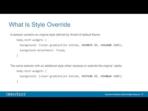
A selector contains an original style defined by
What Is Style Override
A selector contains an original style defined by
Anatomy Of Style Overrides
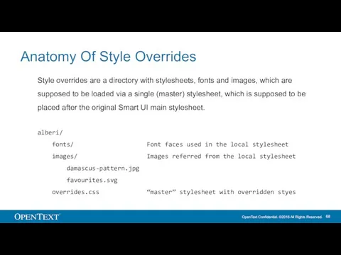
Style overrides are a directory with stylesheets, fonts
Anatomy Of Style Overrides
Style overrides are a directory with stylesheets, fonts
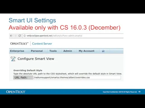
Smart UI Settings
Available only with CS 16.0.3 (December)
Smart UI Settings
Available only with CS 16.0.3 (December)
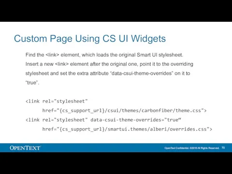
Custom Page Using CS UI Widgets
Find the element, which loads
Custom Page Using CS UI Widgets
Find the element, which loads
 Работа с прессой. Пресс-релизы
 Интернет в жизни старшеклассников: за и против
 Osnovnye_kharakteristiki_liniy_svyazi
 С++. Циклические операторы
 Программирование ветвящихся алгоритмов
 Криптографические протоколы, ранние протоколы согласования ключей
 Информатика и общество. История и перспективы развития компьютеров. Информация и управление. Информационное общество
 Создание и оформление реферата
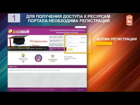 Получение доступа к ресурсам портала ZAсобой
 Реляционные операторы и язык sql
 Концепция автоматизации. Ярмарка 2.0
 Информационные технологии Презентацию выполнили студентки ГБОУ СПО Баймакский сельскохозяйственный техникум Алибаева М.Ф. и
 Викторина для 9-х классов
 Программные средства ПК. Основные понятия операционной системы
 Предмет, объект и составные части информатики. Системы счисления. (Тема 1)
 Теоретические основы информатики
 Data Modeling and Databases Lab 3: Introduction to SQL
 Программирование на Java
 Динамические (электронные) таблицы как информационные объекты
 ИНФОРМАЦИЯ. ИНФОРМАТИКА. ИНФОРМАТИЗАЦИЯ.
 Презентация по информатике
 Правила работы на клавиатуре
 Система управления базами данных Access
 Разработка модуля Библиотека АИС ФИиСТех
 Базы данных. Использование SQL для построения запросов
 Безопасность интернет-банкинга. Основные средства защиты счета
 «Что такое Интернет?»
 Линейный алгоритм