- New pt pro design – information for dealers

Содержание
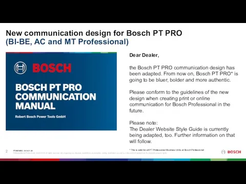
- 2. New communication design for Bosch PT PRO (BI-BE, AC and MT Professional) Dear Dealer, the Bosch
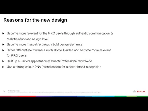
- 3. Reasons for the new design Become more relevant for the PRO users through authentic communication &
- 4. PT-BI/MK | 2018-09-05 © Robert Bosch Power Tools GmbH 2018. All rights reserved, also regarding any
- 5. PT-BI/MK | 2018-09-05 © Robert Bosch Power Tools GmbH 2018. All rights reserved, also regarding any
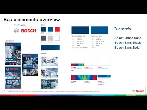
- 6. Basic elements overview SYMBOL/LOGOTYPE - The Bosch symbol/logotype is usually placed on the Bold Blue Gradient
- 7. PT-BI/MK | 2018-09-05 © Robert Bosch Power Tools GmbH 2018. All rights reserved, also regarding any
- 8. Before and after Example II PT-BI/MK | 2018-09-05 © Robert Bosch Power Tools GmbH 2018. All
- 9. Before and after Example III PT-BI/MK | 2018-09-05 © Robert Bosch Power Tools GmbH 2018. All
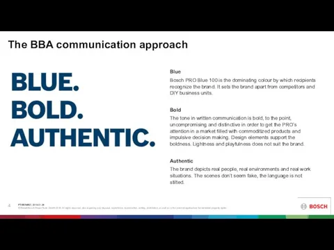
- 10. BLUE BOLD AUTHENTIC PT-BI/MK | 2018-09-05 © Robert Bosch Power Tools GmbH 2018. All rights reserved,
- 11. BLUE BOLD AUTHENTIC MOOD PT-BI/MK | 2018-09-05 © Robert Bosch Power Tools GmbH 2018. All rights
- 12. BLUE BOLD AUTHENTIC PT-BI/MK | 2018-09-05 © Robert Bosch Power Tools GmbH 2018. All rights reserved,
- 13. BLUE BOLD AUTHENTIC © Robert Bosch Power Tools GmbH 2018. All rights reserved, also regarding any
- 15. Скачать презентацию
New communication design for Bosch PT PRO
(BI-BE, AC and MT
New communication design for Bosch PT PRO (BI-BE, AC and MT
Reasons for the new design
Become more relevant for the PRO users
Reasons for the new design
Become more relevant for the PRO users
PT-BI/MK | 2018-09-05
© Robert Bosch Power Tools GmbH 2018. All rights reserved, also regarding
PT-BI/MK | 2018-09-05
© Robert Bosch Power Tools GmbH 2018. All rights reserved, also regarding
PT-BI/MK | 2018-09-05
© Robert Bosch Power Tools GmbH 2018. All rights reserved, also regarding
PT-BI/MK | 2018-09-05
© Robert Bosch Power Tools GmbH 2018. All rights reserved, also regarding
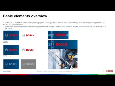
Basic elements overview
SYMBOL/LOGOTYPE - The Bosch symbol/logotype is usually placed on
Basic elements overview
SYMBOL/LOGOTYPE - The Bosch symbol/logotype is usually placed on
PT-BI/MK | 2018-09-05
© Robert Bosch Power Tools GmbH 2018. All rights reserved, also regarding
PT-BI/MK | 2018-09-05
© Robert Bosch Power Tools GmbH 2018. All rights reserved, also regarding
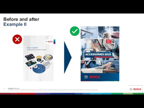
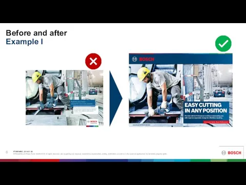
Before and after
Example II
PT-BI/MK | 2018-09-05
© Robert Bosch Power Tools GmbH 2018. All rights
Before and after
Example II
PT-BI/MK | 2018-09-05
© Robert Bosch Power Tools GmbH 2018. All rights

Before and after
Example III
PT-BI/MK | 2018-09-05
© Robert Bosch Power Tools GmbH 2018. All rights
Before and after
Example III
PT-BI/MK | 2018-09-05
© Robert Bosch Power Tools GmbH 2018. All rights
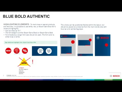
BLUE BOLD AUTHENTIC
PT-BI/MK | 2018-09-05
© Robert Bosch Power Tools GmbH 2018. All rights reserved,
BLUE BOLD AUTHENTIC
PT-BI/MK | 2018-09-05
© Robert Bosch Power Tools GmbH 2018. All rights reserved,
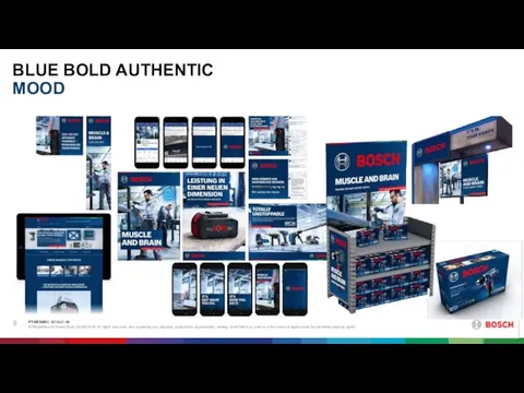
BLUE BOLD AUTHENTIC
MOOD
PT-BI/MK | 2018-09-05
© Robert Bosch Power Tools GmbH 2018. All rights reserved,
BLUE BOLD AUTHENTIC
MOOD
PT-BI/MK | 2018-09-05
© Robert Bosch Power Tools GmbH 2018. All rights reserved,
BLUE BOLD AUTHENTIC
PT-BI/MK | 2018-09-05
© Robert Bosch Power Tools GmbH 2018. All rights reserved,
BLUE BOLD AUTHENTIC
PT-BI/MK | 2018-09-05
© Robert Bosch Power Tools GmbH 2018. All rights reserved,
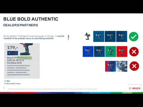
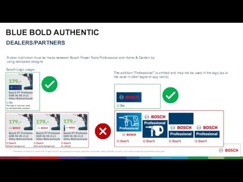
BLUE BOLD AUTHENTIC
© Robert Bosch Power Tools GmbH 2018. All rights reserved, also regarding
BLUE BOLD AUTHENTIC
© Robert Bosch Power Tools GmbH 2018. All rights reserved, also regarding
 Интерактивные конструкции
 Дальневосточная дирекция по капитальному строительству
 Декоративная Роспись по дереву
 Երեխայի և ծնողի զբոսանքի համար նախատեսված միջոց. Համակարգչային գեղարվեստական նախագծում
 Триггеры. Особенность последовательностных логических устройств
 Ремонт трубопроводов и арматуры котельной установки
 День наоборот
 80 лет бабушке
 Point
Point Комбинированные системы электроснабжения. Опыт эксплуатации, вопросы импортозамещения и удаленного мониторинга
 Для любимых друзей Артура и Ирины
 Материалы для дистанционной поддержки учащихся по дополнительной программе
 Ответственность
 Защита проектов
 Вебинар по особенностям и порядке подготовки практики
 Деревянный стул-стремянка
 Фото. Ми роду козацького діти
 Рабочий отчет департамента аналитики компании IPO
 Поліпшення грунтів
 Imtihon_
 The heroes 3. Random map. Generator
 Пригласительные на свадьбу
 Федоров Федор Яковлевич
 Разработка электронной системы управления электрооборудованием трактора беларусь 35 23
 День работника сельского хозяйства
 Тайны древних курганов
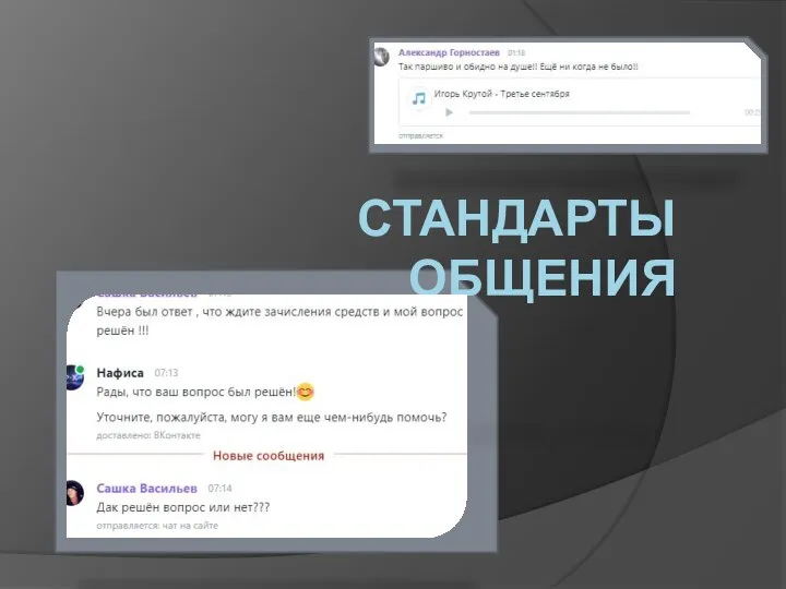 стандарты общения
 Шаблон: коммерческое предложение