- Slide design

Содержание
- 2. Background colors -Don’t be too creative
- 3. Colors Good contrast is important Yellow on dark blue Black on white White on black Be
- 4. YELLOW
- 5. BLACK
- 6. WHITE
- 7. Colors may look different on the screen
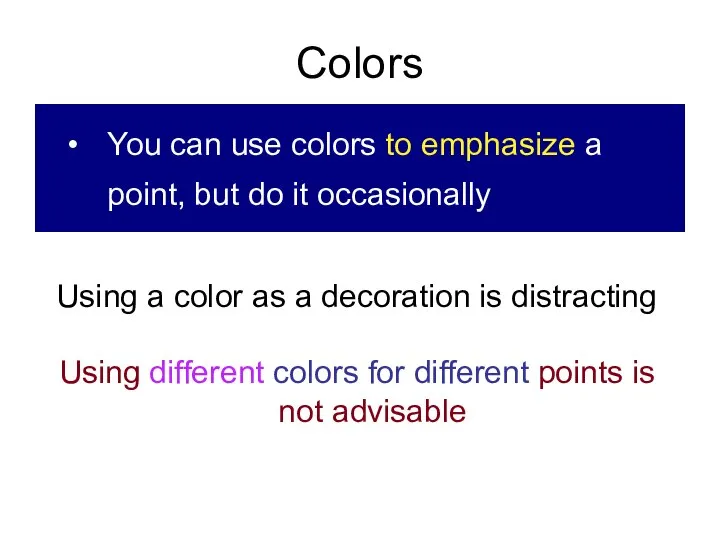
- 8. Colors You can use colors to emphasize a point, but do it occasionally Using a color
- 9. COLORS Do not use red and green as a combination Do not use distracting background Do
- 10. Specifičnosti intenzivne terapije pacijenata sa HOBP Dobro tolerišu loše GAK U proceni potrebe za mehaničkom ventilacijom
- 11. Text on slides 1.No more than five lines 2.About six words per line 3.Use only key
- 12. Fonts Be sure that everybody can read it Try to make 28 the smallest Use different
- 13. Typography for doctors Sans serif for headings You can use sans serif font for headings (Arial),
- 14. Fonts Not more than two fonts per slide DO NOT USE ALL CAPITALS Never underline For
- 15. Keep your color schemes simple and traditional, and never use red unless you have somthing to
- 16. What was wrong with that slide?
- 17. Don’t use RED color to emphasize text
- 18. PICTURES (Photographs) ON THE SLIDE
- 19. Don’t do this!
- 20. PREPARATION PATIENT
- 21. Animation
- 22. Animations Use sparingly, for emphasizing points Useful to bring one point at the time It can
- 24. Скачать презентацию
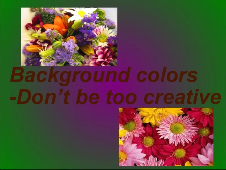
Background colors
-Don’t be too creative
Background colors
-Don’t be too creative
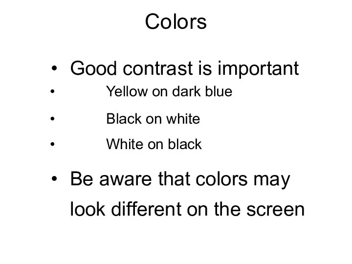
Colors
Good contrast is important
Yellow on dark blue
Black on white
White on
Colors
Good contrast is important
Yellow on dark blue
Black on white
White on
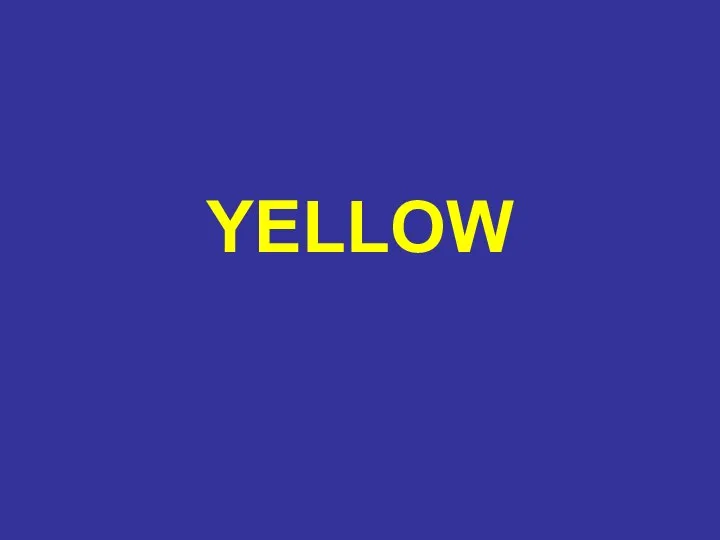
YELLOW
YELLOW
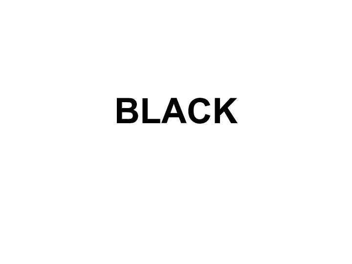
BLACK
BLACK
WHITE
WHITE
Colors may look different on the screen
Colors may look different on the screen
Colors
You can use colors to emphasize a point, but do it
Colors
You can use colors to emphasize a point, but do it
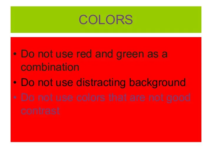
COLORS
Do not use red and green as a combination
Do not use
COLORS
Do not use red and green as a combination
Do not use
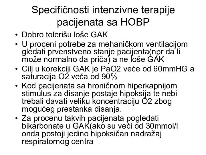
Specifičnosti intenzivne terapije pacijenata sa HOBP
Dobro tolerišu loše GAK
U proceni potrebe
Specifičnosti intenzivne terapije pacijenata sa HOBP
Dobro tolerišu loše GAK
U proceni potrebe
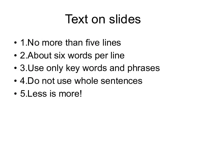
Text on slides
1.No more than five lines
2.About six words per line
3.Use
Text on slides
1.No more than five lines
2.About six words per line
3.Use
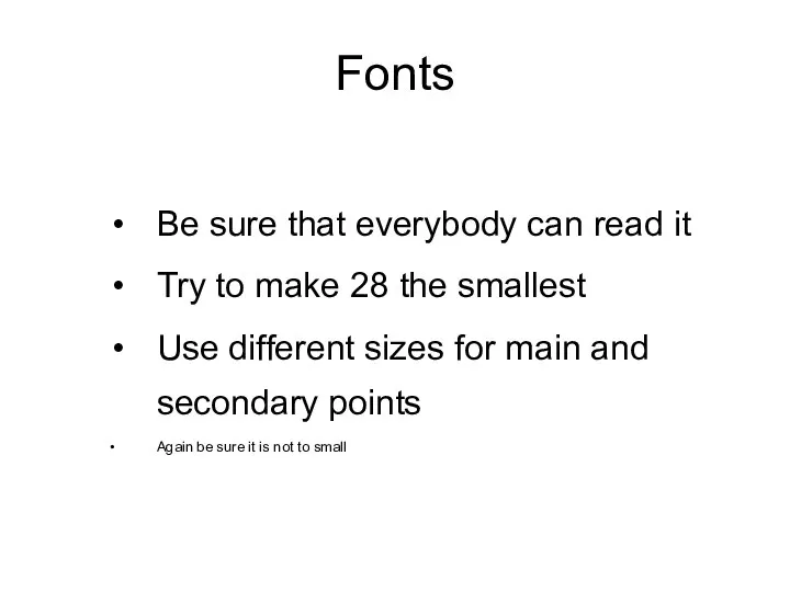
Fonts
Be sure that everybody can read it
Try to make 28 the
Fonts
Be sure that everybody can read it
Try to make 28 the
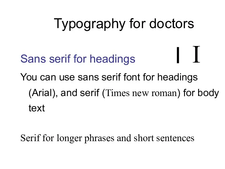
Typography for doctors
Sans serif for headings
You can use sans serif font
Typography for doctors
Sans serif for headings
You can use sans serif font
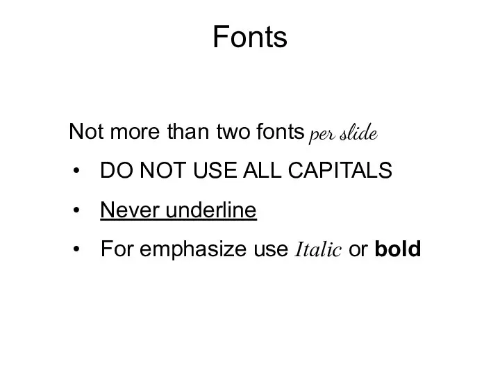
Fonts
Not more than two fonts per slide
DO NOT USE ALL CAPITALS
Never
Fonts
Not more than two fonts per slide
DO NOT USE ALL CAPITALS
Never
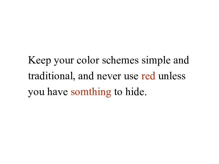
Keep your color schemes simple and traditional, and never use red
Keep your color schemes simple and traditional, and never use red
What was wrong with that slide?
What was wrong with that slide?
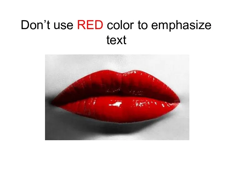
Don’t use RED color to emphasize text
Don’t use RED color to emphasize text
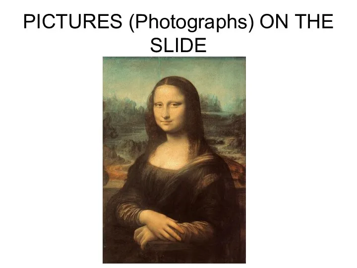
PICTURES (Photographs) ON THE SLIDE
PICTURES (Photographs) ON THE SLIDE
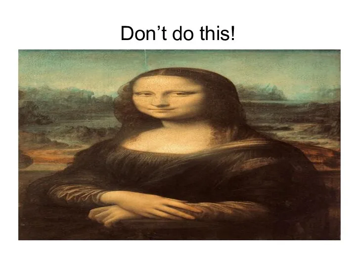
Don’t do this!
Don’t do this!
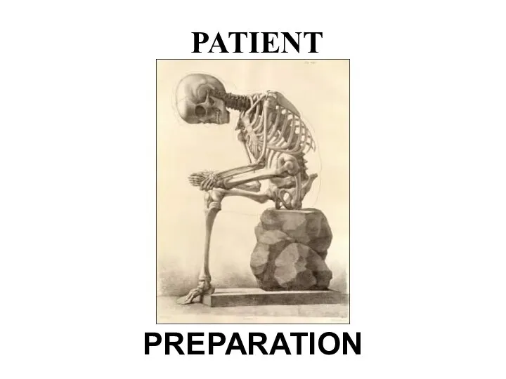
PREPARATION
PATIENT
PREPARATION
PATIENT
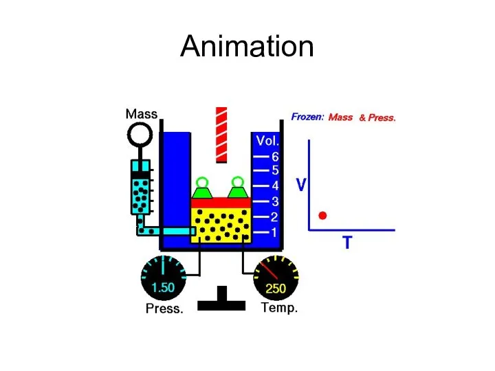
Animation
Animation
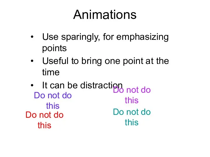
Animations
Use sparingly, for emphasizing points
Useful to bring one point at the
Animations
Use sparingly, for emphasizing points
Useful to bring one point at the
 Ритм линий и пятен, цвет – средства выразительности любой композиции
 Декорации к стоп-моушен мультфильму
 Год театра в России
 Сложный мир исторической картины
 Московский городской конкурс Народов московских многоцветье
 Фасад здания. Архитектурный образ. Генеральный план. Понятия и средства выразительности
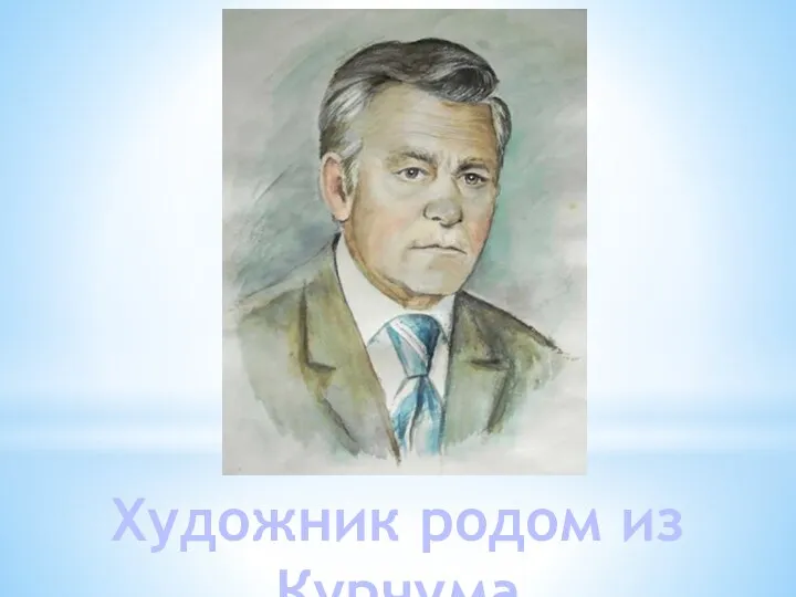 Художник родом из Курчума - Пермяков Павел Михайлович
 История народной культуры. Декоративно - прикладное искусство древней Руси
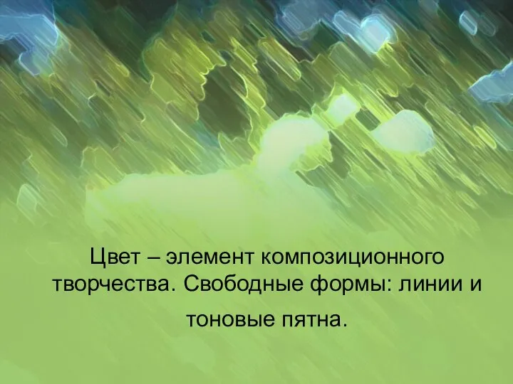 Цвет – элемент композиционного творчества. Свободные формы: линии и тоновые пятна
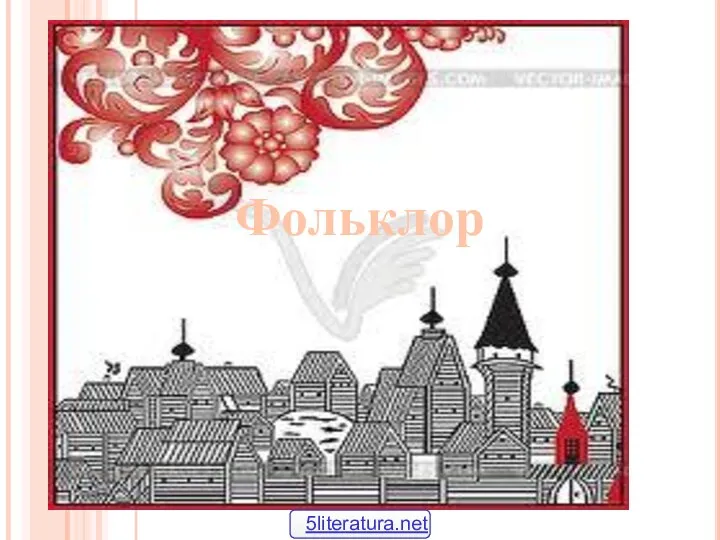 Народный фольклор
 Український внесок у цивілізаційний розвиток світу
 Salvador Dali. Magical art
 Высокий классицизм и развитие ампира
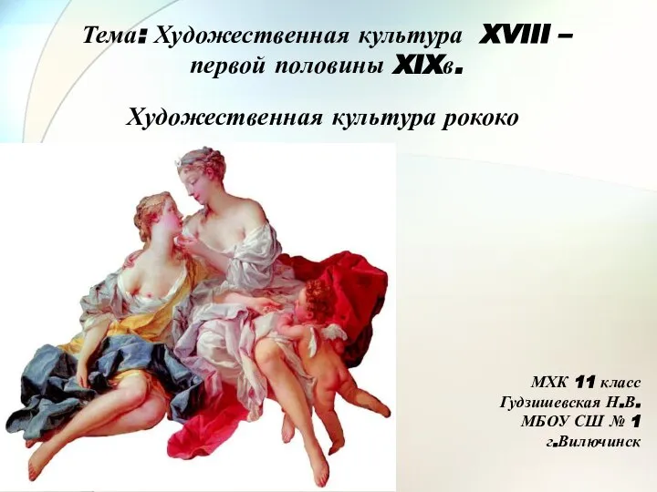 Художественная культура XVIII - первой половины XIX в
 Золотые руки. С чего начинается вышивка?
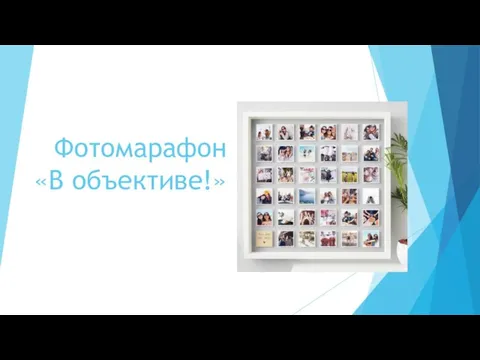 Фотомарафон В объективе!
 Театр как особый вид сценического искусства
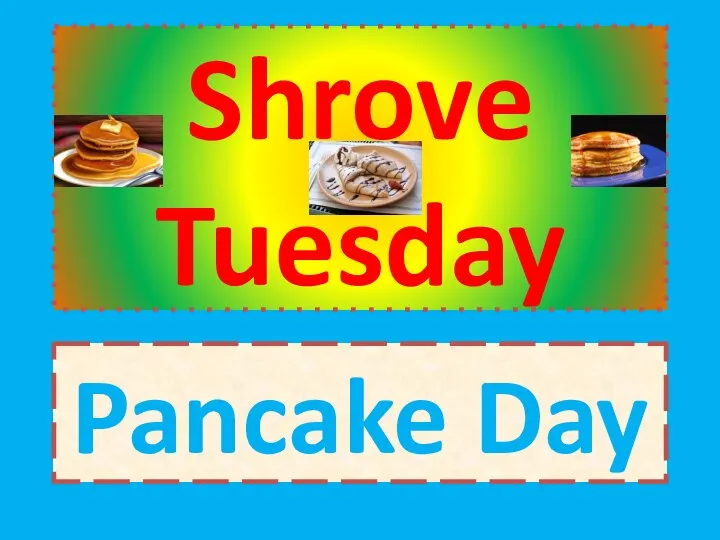 Shrove Tuesday
 Угадай песню по картинке
 Бхакти-шастри. Нектар преданности
 St. Valentine's Day
 Тарелочка из глины
 Народный костюм. Разнообразие поясов в русском народном костюме
 Пуантилизм
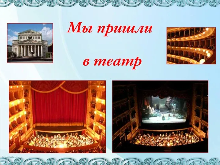 Мы пришли в театр
 Романтический стиль
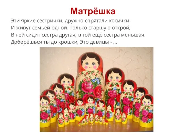 Матрёшка. Поэтапное рисование
 Сценическое искусство в эпоху новейшего времени (XX – XXI вв.)