- Making PowerPoint Slides Avoiding the Pitfalls of Bad Slides

Содержание
- 2. Tips to be Covered Outlines Slide Structure Fonts Colour Background Graphs Spelling and Grammar Conclusions Questions
- 3. Outline Make your 1st or 2nd slide an outline of your presentation Ex: previous slide Follow
- 4. Slide Structure – Good Use 1-2 slides per minute of your presentation Write in point form,
- 5. Slide Structure - Bad This page contains too many words for a presentation slide. It is
- 6. Slide Structure – Good Show one point at a time: Will help audience concentrate on what
- 7. Slide Structure - Bad Do not use distracting animation Do not go overboard with the animation
- 8. Fonts - Good Use at least an 18-point font Use different size fonts for main points
- 9. Fonts - Bad If you use a small font, your audience won’t be able to read
- 10. Colour - Good Use a colour of font that contrasts sharply with the background Ex: blue
- 11. Colour - Bad Using a font colour that does not contrast with the background colour is
- 12. Background - Good Use backgrounds such as this one that are attractive but simple Use backgrounds
- 13. Background – Bad Avoid backgrounds that are distracting or difficult to read from Always be consistent
- 14. Graphs - Good Use graphs rather than just charts and words Data in graphs is easier
- 15. Graphs - Bad
- 16. Graphs - Good
- 17. Graphs - Bad
- 18. Graphs - Bad Minor gridlines are unnecessary Font is too small Colours are illogical Title is
- 19. Spelling and Grammar Proof your slides for: speling mistakes the use of of repeated words grammatical
- 20. Conclusion Use an effective and strong closing Your audience is likely to remember your last words
- 22. Скачать презентацию
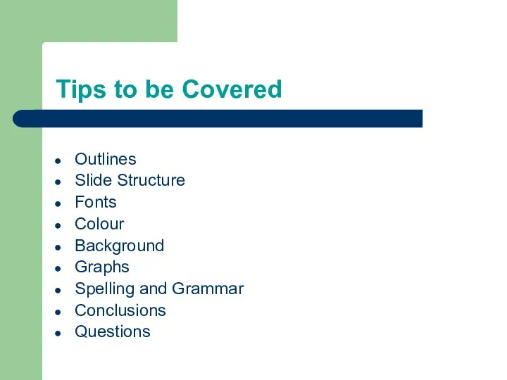
Tips to be Covered
Outlines
Slide Structure
Fonts
Colour
Background
Graphs
Spelling and Grammar
Conclusions
Questions
Tips to be Covered
Outlines
Slide Structure
Fonts
Colour
Background
Graphs
Spelling and Grammar
Conclusions
Questions
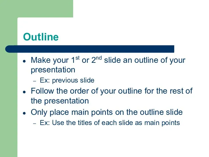
Outline
Make your 1st or 2nd slide an outline of your presentation
Ex:
Outline
Make your 1st or 2nd slide an outline of your presentation
Ex:
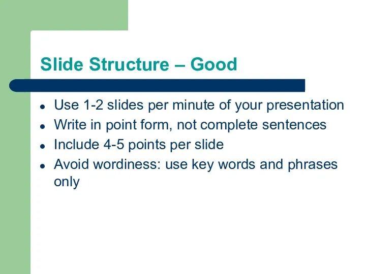
Slide Structure – Good
Use 1-2 slides per minute of your presentation
Write
Slide Structure – Good
Use 1-2 slides per minute of your presentation
Write
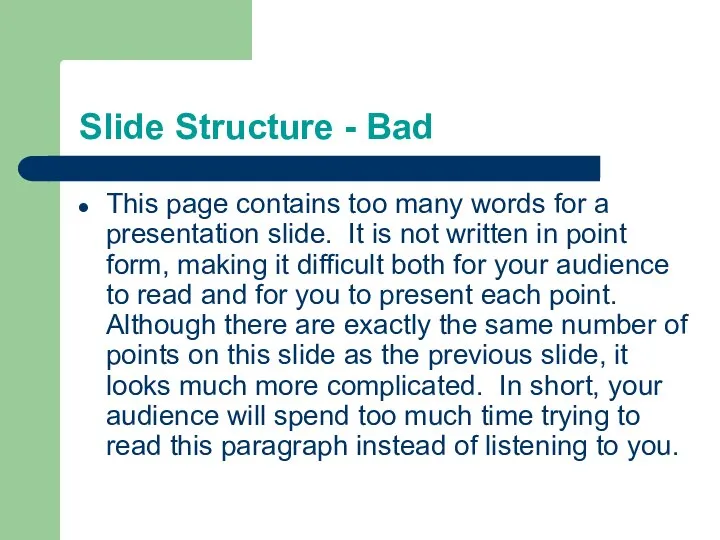
Slide Structure - Bad
This page contains too many words for a
Slide Structure - Bad
This page contains too many words for a

Slide Structure – Good
Show one point at a time:
Will help audience
Slide Structure – Good
Show one point at a time:
Will help audience

Slide Structure - Bad
Do not use distracting animation
Do not go overboard
Slide Structure - Bad
Do not use distracting animation
Do not go overboard

Fonts - Good
Use at least an 18-point font
Use different size fonts
Fonts - Good
Use at least an 18-point font
Use different size fonts

Fonts - Bad
If you use a small font, your audience won’t
Fonts - Bad
If you use a small font, your audience won’t

Colour - Good
Use a colour of font that contrasts sharply with
Colour - Good
Use a colour of font that contrasts sharply with

Colour - Bad
Using a font colour that does not contrast with
Colour - Bad
Using a font colour that does not contrast with

Background - Good
Use backgrounds such as this one that are attractive
Background - Good
Use backgrounds such as this one that are attractive
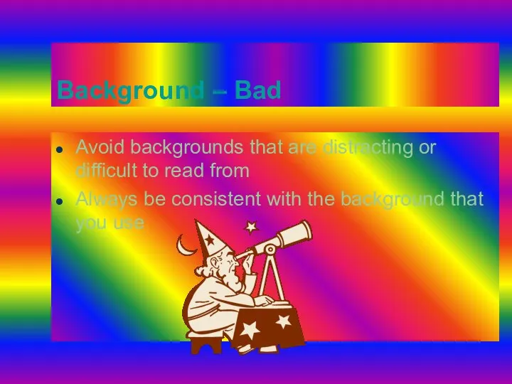
Background – Bad
Avoid backgrounds that are distracting or difficult to read
Background – Bad
Avoid backgrounds that are distracting or difficult to read
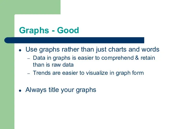
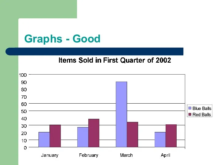
Graphs - Good
Use graphs rather than just charts and words
Data in
Graphs - Good
Use graphs rather than just charts and words
Data in

Graphs - Bad
Graphs - Bad
Graphs - Good
Graphs - Good

Graphs - Bad
Graphs - Bad

Graphs - Bad
Minor gridlines are unnecessary
Font is too small
Colours are illogical
Title
Graphs - Bad
Minor gridlines are unnecessary
Font is too small
Colours are illogical
Title

Spelling and Grammar
Proof your slides for:
speling mistakes
the use of of repeated
Spelling and Grammar
Proof your slides for:
speling mistakes
the use of of repeated

Conclusion
Use an effective and strong closing
Your audience is likely to remember
Conclusion
Use an effective and strong closing
Your audience is likely to remember
 My name is Dasha Antonova!
 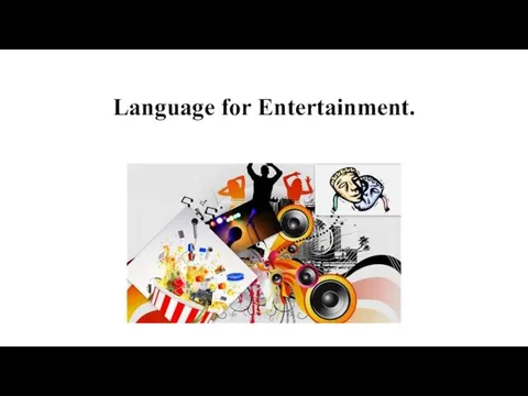 Language for Entertainment
 Что повлияло на формирование американского варианта английского языка
 There is/There are
 В АЭРОПОРТУ Автор: Енин Денис Сергеевич, ученик 10 класса,МОУ СОШ №7,с.Преградного.
 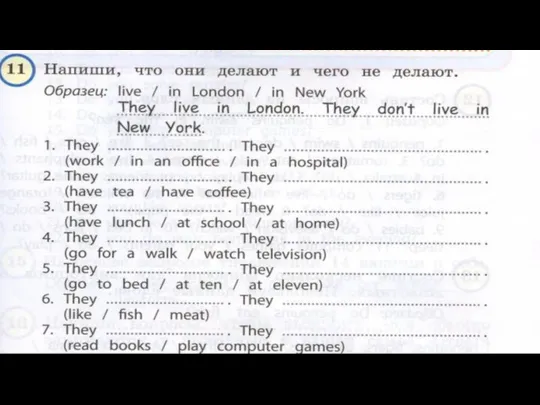 Write down what they do and what they don't
 Презентация к уроку английского языка "The Golden Ring of Russia" - скачать бесплатно
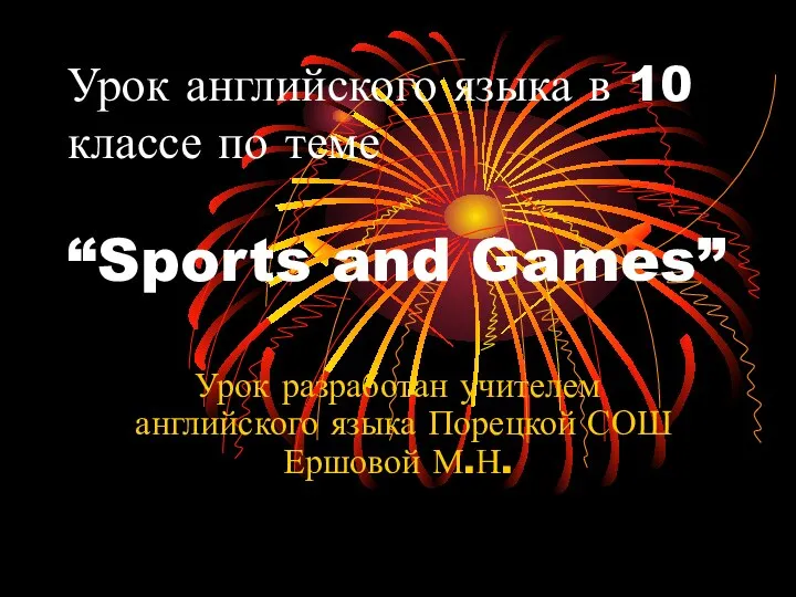 Sports and Games. 10 класс
 Праздники Англии
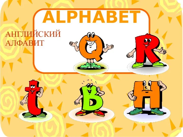 Презентация к уроку английского языка "Sunny alphabet" - скачать бесплатно
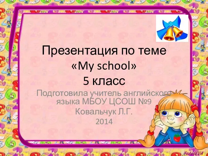 Презентация по теме «My school» 5 класс Подготовила учитель английского языка МБОУ ЦСОШ №9 Ковальчук Л.Г. 2014
 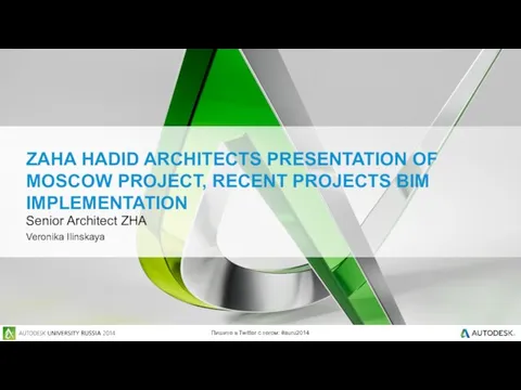 Zaha Нadid Аrchitects of Мoscow project, recent projects bim implementation
 Facts about the UK
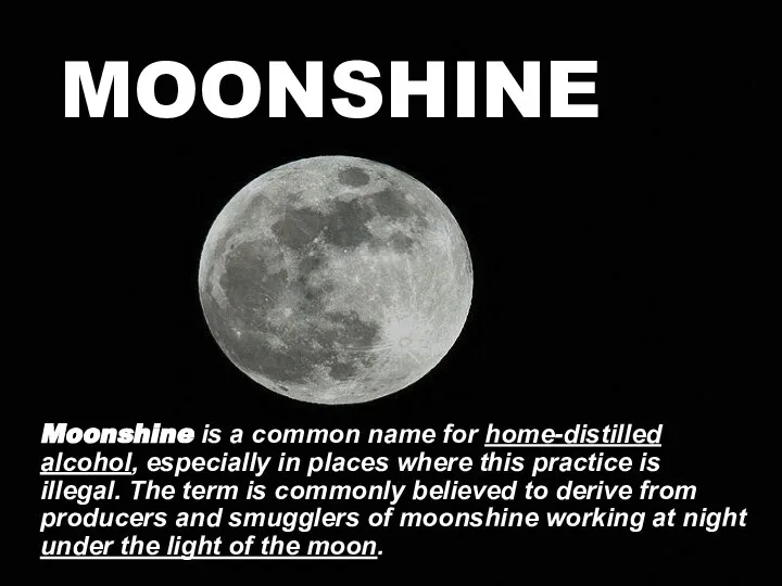 MOONSHINE Moonshine is a common name for home-distilled alcohol, especially in places where this practice is illegal. The term is commonly believed to derive from producers and smugglers of moonshine working at night under the light of the
 Person's character. Характер человека
 Plurals Game
 Презентация по английскому языку Молодежные субкультуры.Youth subcultures
 Презентация к уроку английского языка "Музей собак" - скачать бесплатно
 Grade 2. Lesson 37-38
 Dvizh. Spotlight 7
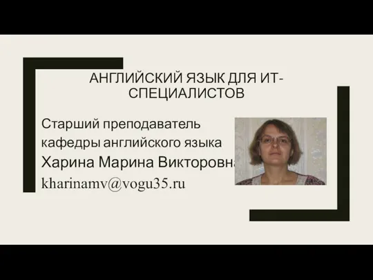 Английский язык для ит-специалистов
 My Favourite town
 Урок английского языка в 4 классе МОУ лицей «Технико –экономический» Учитель английского языка Кунина Наталья Сергеевна
  Adults
 You have found some interesting material for the presentation and you want to read this text to your friend
 Презентация к уроку английского языка "New Zealand" - скачать бесплатно
 Canada is situated on the North American continent
 Attack and defense. Атака и оборона. Развитие аргументативной ситуации