- Making PowerPoint Slides

Содержание
- 2. Tips to be Covered Outlines Slide Structure Fonts Colour Background Graphs Spelling and Grammar Conclusions Questions
- 3. Outline Make your 1st or 2nd slide an outline of your presentation Ex: previous slide Follow
- 4. Slide Structure – Good Use 1-2 slides per minute of your presentation Write in point form,
- 5. Slide Structure - Bad This page contains too many words for a presentation slide. It is
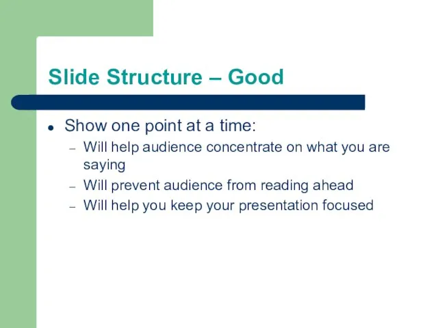
- 6. Slide Structure – Good Show one point at a time: Will help audience concentrate on what
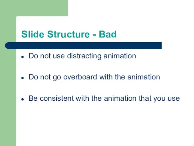
- 7. Slide Structure - Bad Do not use distracting animation Do not go overboard with the animation
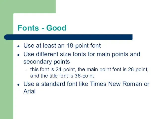
- 8. Fonts - Good Use at least an 18-point font Use different size fonts for main points
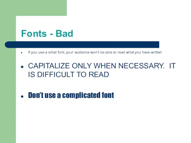
- 9. Fonts - Bad If you use a small font, your audience won’t be able to read
- 10. Colour - Good Use a colour of font that contrasts sharply with the background Ex: blue
- 11. Colour - Bad Using a font colour that does not contrast with the background colour is
- 12. Background - Good Use backgrounds such as this one that are attractive but simple Use backgrounds
- 13. Background – Bad Avoid backgrounds that are distracting or difficult to read from Always be consistent
- 14. Graphs - Good Use graphs rather than just charts and words Data in graphs is easier
- 15. Graphs - Bad
- 16. Graphs - Good
- 17. Graphs - Bad
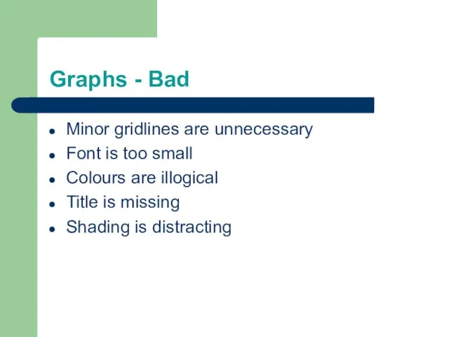
- 18. Graphs - Bad Minor gridlines are unnecessary Font is too small Colours are illogical Title is
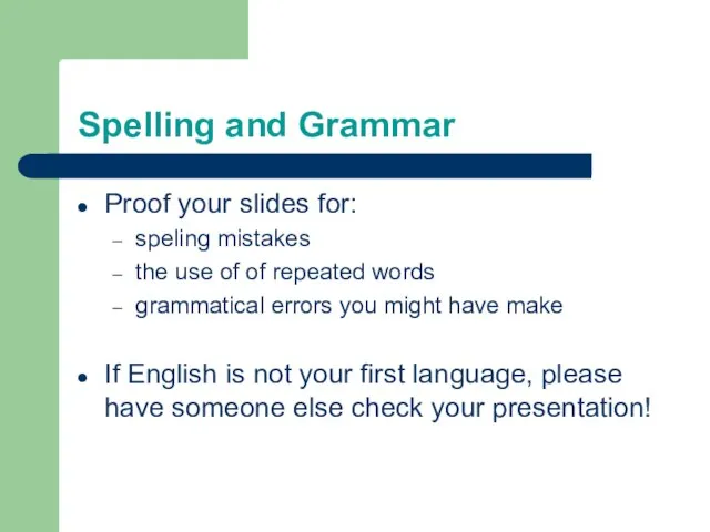
- 19. Spelling and Grammar Proof your slides for: speling mistakes the use of of repeated words grammatical
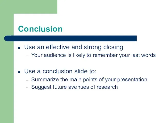
- 20. Conclusion Use an effective and strong closing Your audience is likely to remember your last words
- 22. Скачать презентацию
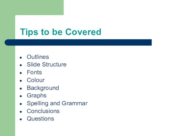
Tips to be Covered
Outlines
Slide Structure
Fonts
Colour
Background
Graphs
Spelling and Grammar
Conclusions
Questions
Tips to be Covered
Outlines
Slide Structure
Fonts
Colour
Background
Graphs
Spelling and Grammar
Conclusions
Questions
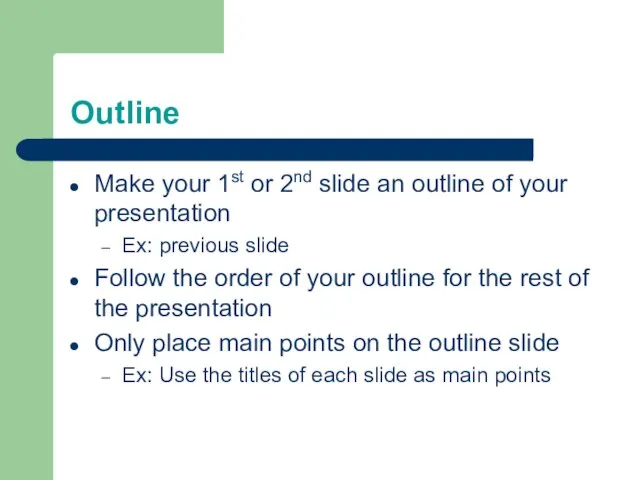
Outline
Make your 1st or 2nd slide an outline of your presentation
Ex:
Outline
Make your 1st or 2nd slide an outline of your presentation
Ex:
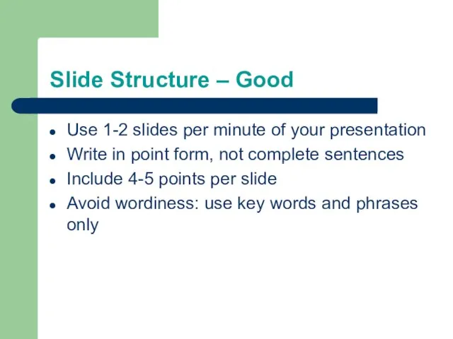
Slide Structure – Good
Use 1-2 slides per minute of your presentation
Write
Slide Structure – Good
Use 1-2 slides per minute of your presentation
Write
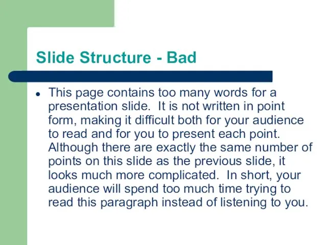
Slide Structure - Bad
This page contains too many words for a
Slide Structure - Bad
This page contains too many words for a
Slide Structure – Good
Show one point at a time:
Will help audience
Slide Structure – Good
Show one point at a time:
Will help audience
Slide Structure - Bad
Do not use distracting animation
Do not go overboard
Slide Structure - Bad
Do not use distracting animation
Do not go overboard
Fonts - Good
Use at least an 18-point font
Use different size fonts
Fonts - Good
Use at least an 18-point font
Use different size fonts
Fonts - Bad
If you use a small font, your audience won’t
Fonts - Bad
If you use a small font, your audience won’t
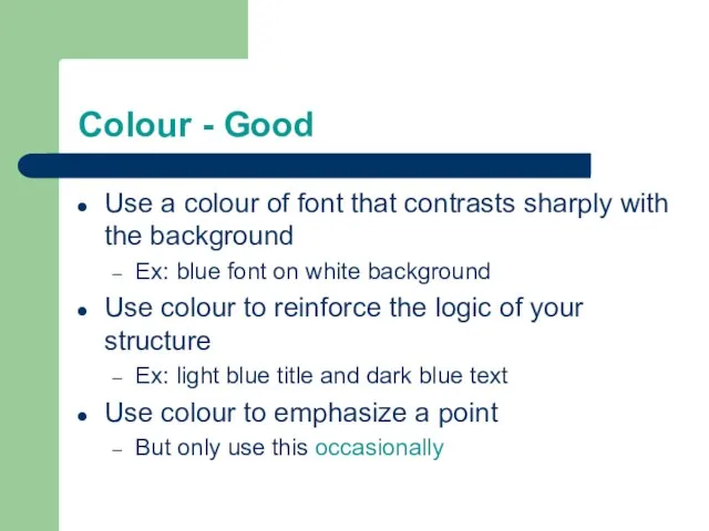
Colour - Good
Use a colour of font that contrasts sharply with
Colour - Good
Use a colour of font that contrasts sharply with
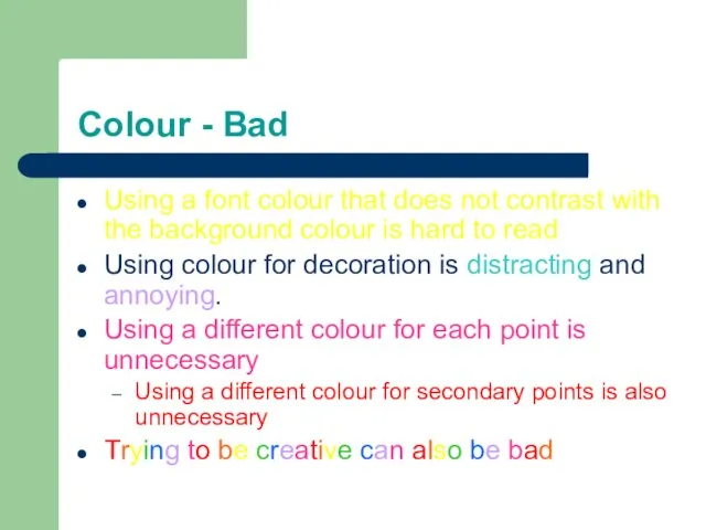
Colour - Bad
Using a font colour that does not contrast with
Colour - Bad
Using a font colour that does not contrast with
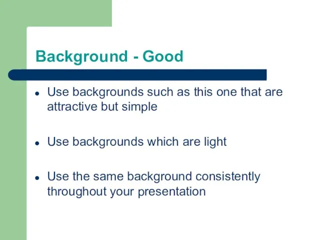
Background - Good
Use backgrounds such as this one that are attractive
Background - Good
Use backgrounds such as this one that are attractive
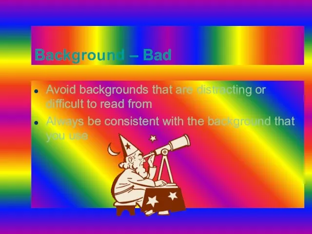
Background – Bad
Avoid backgrounds that are distracting or difficult to read
Background – Bad
Avoid backgrounds that are distracting or difficult to read
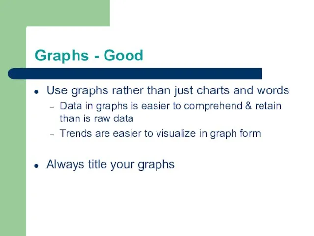
Graphs - Good
Use graphs rather than just charts and words
Data in
Graphs - Good
Use graphs rather than just charts and words
Data in
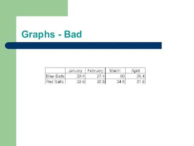
Graphs - Bad
Graphs - Bad
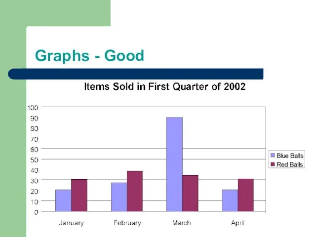
Graphs - Good
Graphs - Good
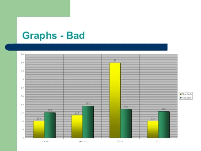
Graphs - Bad
Graphs - Bad
Graphs - Bad
Minor gridlines are unnecessary
Font is too small
Colours are illogical
Title
Graphs - Bad
Minor gridlines are unnecessary
Font is too small
Colours are illogical
Title
Spelling and Grammar
Proof your slides for:
speling mistakes
the use of of repeated
Spelling and Grammar
Proof your slides for:
speling mistakes
the use of of repeated
Conclusion
Use an effective and strong closing
Your audience is likely to remember
Conclusion
Use an effective and strong closing
Your audience is likely to remember
 Сканер. Принцип работы сканера
 Реестр – это база данных, в которой хранятся сведения о настройках и конфигурации компьютера, операционной системы и установленны
 Госуслуги
 Презентация на тему Моделирование
  Методы объектов. (Занятие 8)
 Система электронного документооборота СЭД DirectumRX
 Представление о Power Point
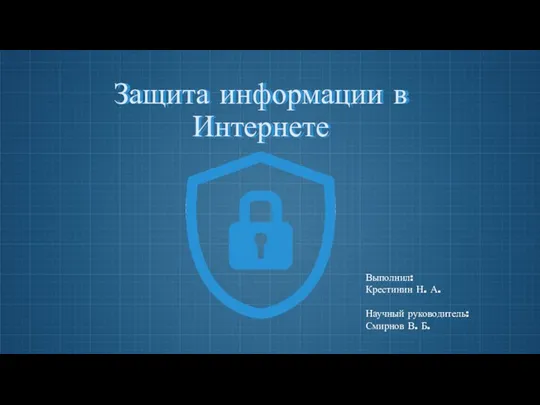 Защита информации в Интернете
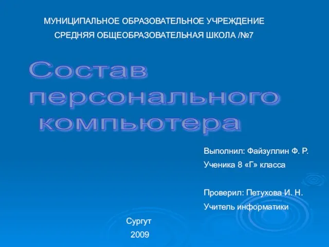 Презентация "Состав персонального компьютера" - скачать презентации по Информатике
 Информатика
 Рекламно-информационный, познавательный журнал Home Magazine
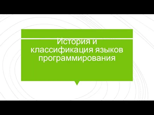 История и классификация языков программирования
 Методические материалы по изучению мультикастового вещания
 Пример решения задачи планирования производства в EXCEL
 Understanding Databases
 The Internet of Things
 Компьютерные сети
 Список общедоступных баз данных
 SCADA-система КАСКАД. Концептуальные решения для ЗАО Тандер
 Счета-фактуры по корректировкам отгрузок и возвратам, сводные справки. 1С:ERP Управление предприятием 2
 Stealth и Стелс шутеров
 Транспортные протоколы
 Разработка тестов
 Виды БД
 Язык С#. Состав языка
 Примеры символьной обработки (язык C, лекция 9)
 Презентация "Межсетевые экраны" - скачать презентации по Информатике
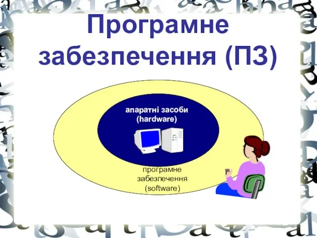 Програмне забезпечення. Апаратні засоби